|

|
|||
|
Portland art blog + news + exhibition reviews + galleries + contemporary northwest art
|
||||


Andy Warhol retrospective interview with Richard Axsom 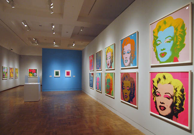 Andy Warhol Prints from the Collections of Jordan D. Schnitzer and His Family Foundation at the Portland Art Museum (all photos Jeff Jahn) The current retrospective at the Portland Art Museum, Andy Warhol: Prints from the Collections of Jordan D. Schnitzer and His Family Foundation is the largest of this seminal artist's output ever and should be on the to do list for anyone who can make it. There is breadth and scope here so PORT took a walk through to discuss the exhibition with noted print scholar and curator Richard Axsom, who contributed an essay to the catalog. Like so many Post WWII artists Warhol had mostly drained his work of allegory while introducing popular iconography as a kind of folk or kitsch context. This was something fascists had abused so Warhol's rise as an artist became a rehabilitation of sorts, bringing back iconic secularism without nationalistic jingoism and other subjugation. As the Cold War continued Warhol became became the defacto Pope of Americana, canonizing our pop culture saints and sinners, addressing capitalistic, societal and more underground iconography alike so I was eager to geek out with Axsom on one of the true greats and touchstones of the late Twentieth Century. Speaking as geek myself if we have inherited the Earth in the Twenty-first Century, Warhol is definitely one of our own... a kind of iconographer in chief who created an extended family with his art production. Jeff Jahn: Welcome to Portland... there is so much here let's do the obvious thing and start the discussion with the early work in this room. Richard Axsom: Well he was the best known and most celebrated graphic designer in in the late 1950's JJ: Paid very well for it too 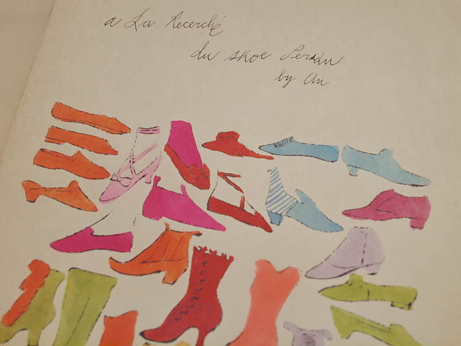 Andy Warhol(detail)À la recherche du shoe perdu, 1955 RA: A huge amount of money and this reflects the directorship that I. Miller gave him to oversee a major shoe campaign. What we see here though wasn't done for commercial promotion. It was done to be a self published artist book for friends. Here is what you might call the portfolio sleeve which the prints fit into into and the title is À la recherche du shoe perdu by An. He didnt finish the title but it referencing Proust's novel À la recherche du temps perdu (In Search of Lost Time, or Remembrance of Things Past). It is already a very savvy and sophisticated bit of language play. His mother hand wrote the inscriptions on all of these. The text is his and the titles are again whimsical plays “my shoe is your shoe” “to shoe or not to shoe” and I love this Alice B show. Which refers to the Alice B Toklas with a man's tie 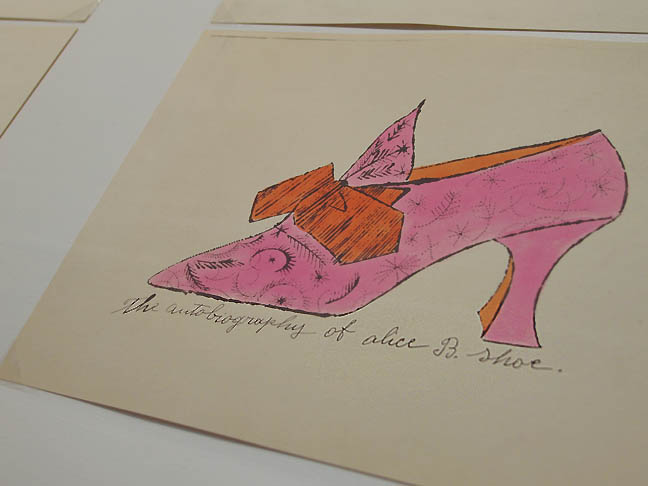
JJ: her famous accessory for dress. She was Gertrude Stein's partner and subject of Stein's most famous work. Not exactly a mainstream figure and would not have been ok for a populist ad campaign but great for a private art project. RA: They are all watercolors, made with a kind of offset process called blotted line. You take a drawing or photograph and you take medium and trace it in dye and then you take a sheet and as with a mono-type you put it on another piece of blank paper and you blot it. JJ: The technique helped him work faster than other designers because he could do multiples of similar drawings with different colors, additions and omissions. It gave him an edge in presentations for clients. RA: The blotted line even becomes a signature aspect of his style. He creates the outlines with the shoe this way and they are water colored by hand. So if you were to look at this work the 50's it stands for his commercial work as a graphic designer. It reflects his interest in consumer goods and things which are advertising... which he then moves off to the side and away from the commercial function and into the realm of art. JJ: Also, with his Slovakian heritage, which has a strong culture of gift giving this folio of shoes is a similar gift and not a commercial production. Thus, this is fine art produced as personal mementos for certain people. Degas famously thought that all artists produced for a small circle of colleagues and I see Warhol as doing that here. Its very personal fine art. He had coloring parties which arent dissimilar from the psysnka egg decorating parties his mother and other women would have. Later the eggs would be given as gifts. Warhol claimed he, "came from nowhere," but you can never take those statements at absolute face value... you absorb things you grow up with. RA: (laughs) an interesting Slovakian connection, I wouldnt have known JJ: Yes gift giving and art making parties are big part of that culture RA: It makes sense as much of the work in this room were made as gifts that were self published or as promotional material as work to show potential clients... but there is that body of gifting here that is very important. JJ: Another thing his mother did pysanska eggs which has a similar indirect line-making technique but in that case it is wax resist. His mother had pysanky egg decorating parties and Andy later had similar shoe folio decorating parties. What's more, his mother was living with him at that time. RA: Right right... exactly JJ: He definitely came from an artistic family and they supported that RA: for sure, overall this is one of my favorites, it has such spirit visually with all the plays on words too. 
Andy Warhol designed Velvet Underground album covers JJ: I think a lot of people will be surprised at how many album covers he did, even before the velvet underground stuff he did a lot of classic jazz LP's for the likes of Count Basie, Artie Shaw and Thelonious Monk. I wish those were here too but these Velvet Underground covers with a bit of The Factory's silver room effect give a sense of collective artistic effort as well. RA: Oh yes... the show will be a revelation for so many people. One of those revelations is just his artistic output. The quantity and the diversity of it. Then there is the photography and the films... the magazines and the editorships. 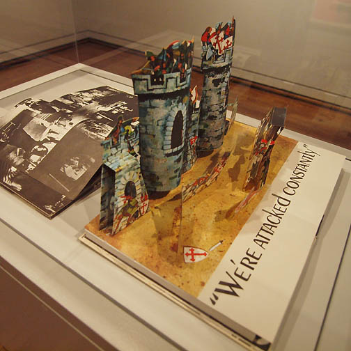 Andy Warhol, Index, 1967 JJ: and the Index pop up book here... drawing on his youth when he was 6 and was stricken with St. Vitus's Dance disease, his mother made him puppets and pop up books. Everyone talks about this stuff. RA: Ah I know! JJ: People bring up that disease all the time but there is something playful about his approach to everything... of course being serious but not taking the act so serious that he couldn't experiment. Basically directing his assistants and making editorial/directorial decisions is a little bit like the pop up book Index where it is essentially miniaturized and portable stagecraft. At age 6 being struck with that disease isolated him and forced him to construct collaborative worlds. Not being serious about something is often a way to achieve seriousness. RA: Or even appearing “not to be serious” about something and yet be serious. 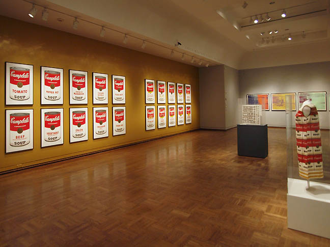
JJ: Reminds me that the late night TV shows and how their comedic monologues are often more social bellwethers than other more serious exposes. RA: Absolutely  And Warhol, Flash-November 22, 1963 (install at Portland Art Museum), 1968 JJ: People always want to to focus on the soup cans but I definitely want to get to the Flash folio with you. I see it as a keystone to the exhibition and it is treated seriously as such with its own room with gray floors and walls. RA: Its amazing, I think it is his greatest portfolio. I'd go out on a limb and say that in a second. Nothing comes close to this. It's special because it doesnt diminish the value of the Cans, Marilyn and Flowers and the later works in the 70's like The Endangered Species which is my favorite. JJ: We will get to that downstairs but Endangered Species was the first art show by any artist that I worked on... I was helping install it at what was then called the West Bend Art Museum in Wisconsin. A small regional museum that is now the Wisconsin Museum of Art. You know the place I'm sure living in Wisconsin. I never got to see Flash while living in the Midwest, this is what Ive been most excited to see. 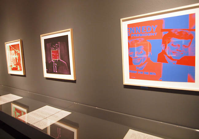 Flash (Kennedy Campaign sourced image on the right) Flash (Kennedy Campaign sourced image on the right)
RA: (gestures around the Flash room) I take these as a profundity and reveals other sides of Warhol. Flash is deeply human and profound and spiritual and not just a on the face shrug as some would say. It has that to a certain extent but its deeply serious. JJ: Looking at these I think about when JFK was assassinated and I wasnt even born yet, Im a gen x-er. It was before my parents ever met but by all accounts it was that first moment in the mass media when there was what some now call trauma vision. A situation where everywhere you look you cant escape the tragic news on TV, and now the internet. The media simply becomes saturated with grief and fear with 911, school shootings, or other terrorist attacks... also when the challenger exploded. I feel like Warhol was addressing the inescapably itself rather than a value judgment on the grief. He's addressing the domination of an interconnected news cycle. I know Warhol spoke about his regret over how sad it made everyone when JFK was assassinated. He seemed to want to move beyond just the oppression of the terrible news and images. Reminds me of the way children at funerals often say the most amazing things when all the adults look for words. RA: I wrote about this in my essay (for the catalog) and at the time everyone was absolutely hysterical when President Kennedy was killed. How they were crying and weeping and grabbing each other. You think, really. “that's Andy Warhol?” It left a deep impression you might say. But also its his observation of the repetition and the desensitizing, the reality being created through the media and at a certain point you tune out. Flash just scrambles the situation in a way that Life magazine didnt... it was too brief and Warhol carries it instead through the non chronological sequence of the prints. This is true of all artists but with Warhol's Flash specifically. If you a really going to think a bout a work of art seriously, past the initial emotional reaction, one thing that can bring you closer to it as a work of art and not an illustration of generalization is to ask yourself what the decisions were? What to include and not include... what color, what composition, what photographic source and how to present it because that is the telling of the story ok... and even the best analytic discern and remove as an intellectual exercise just brings you intimately closer in contact with the work. We can talk about all the language that surrounds Warhol which is totally appropriate like repetition, machine and what it does to society and sometimes I think wait, there is what Frank Stella calls the “Art Part,”which he wont discuss. And that is fine, you can make generalizations and conceptualizations about an artist but when it comes to it you are reading that artwork now and it is specific. It is not there to illustrate the generalizations. So once you get past that here asking why he made this choice or that choice, there is experience. 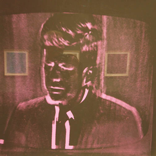 Flash (image sourced from moon landing address to Congress) I took such great pleasure in tracking down all the sources for the photography and then saw what it meant to be non chronological and what you have, which I sorta spell this out in the essay is there is a chronological element here that has been purposefully rearranged and thus is non chronological. It begins with the presence of the campaign of 1960 and this is taken from a poster showing Kennedy for President. JJ: The idealism of it, the potential... RA: Yeah, at the beginning he's smiling and this image appears several times throughout the portfolio. It pops up here and (pointing) over there. JJ: and Jackie of course with that same kind of projected smile. RA: But still not from that moment when the Preseident dies. Then again the other bookend of course from the assassination so here you have 19960 then 1963. I was curious where this particular image was from? JJ: from TV? RA: Exactly, it is something that reads as a televised image and so I thought, huh what is the source? So thank god for Google image, I was just going through and going through and hmmmm... I know Ive seen that before? Then there it is... several photos of a televised address by Kennedy in congress in 1962 he is announcing to congress that Americans will be on the moon by the end of the decade. Then you step back and it is the pinnacle of his presidency. The highest highest point of aspiration. JJ: Warhol has given it a deep purple color... kingly but also a color that can be read as somber or serious... its not a sunny bright image and Kennedy himself is in negative space. RA: So there you have first the presidential campaign, then the pinnacle of presidency and then comes the tragedy. Im not the only one who likens the Kennedy presidency to Greek tragedy. Here we have the beautiful, the handsome the wealthy Kennedy with a beautiful wife and the it comes to absolutely nothing. So the choices of Andy Warhol are important, there is power here certainly. Then you have the color and even some of the images here start to disappear. Look at this, it almost seems like abstract squares of color, its being effaced and as information its almost like it is being pushed back and diminished. 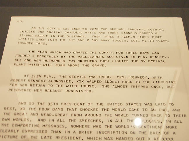 Flash page 17 So the prints themselves alone would be a spectacular portfolio but then you add the teletype cast. JJ: They are like concrete poetry RA: It is concrete poetry and again the irony is this is very dispassionate.. its AP breaking news as a teletype of the funereal mass and procession as they arrive at Arlington. You know that this text was chosen by Warhol and a good friend Philip Greer. They went through all the text and sort of chopped, pasted and cut to create what looks to be a running teletype … with the "d-d-d" stop flash "d-d-d" stop flash. JJ: At the top of each are the page numbers as if to imply it is a contiguous and whole thing. But it is Art and technically not a primary source historical account as its heavily edited from its source material. Yet it presents itself as both which is interesting. RA: Yes JJ: was that then Warhols decision to put those page #'s on? RA: Yes, and then you think “ok well then fine” and then you find theses teletypes are the folders or sleeves into which the images are placed. So up until very recently they were never shown when the flash portfolio was shown, which was very infrequently mind you. But over the past 10 years there have been 5 or 6 presentations one of which did show a selection of some of the pages but this is really astounding because what I would argue and what this installation honors is that the texts are as important as the images. The clincher to this is is when you read through what Warhol has chosen to be this chronological narrative... when you go to this teletype like narrative, like the prints you are moved to tears. My editor took a look at the early draft at my essay for the catalog and I said Carolyn, read the teletype text? She called back after a day and said you know when I was reading it I had tears running down my cheek. It might not be the strongest of observations but when was the last time a Warhol work made you cry? It can't be by Warhol? It is not what he does? But he can do it. 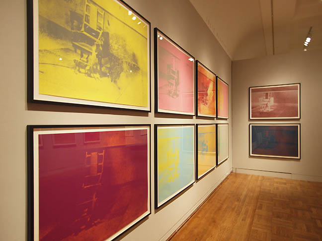
JJ: Later on you have the electric chairs (right around the corner) and the car crashes which are tragic. RA: Very shortly after this Flash series. I mean it is so potent but Im not sure they make you cry? JJ: There isnt as much emotional head room because there is more shock? RA: And fear, I mean those electric chairs imply and invite the reading of “That's where you are going to sit in?” It is the mortality and the memento mori but Warhol is a layered and multifaceted with multiple texts and reads which come together and I love this double narrative of both text and visual JJ: In some ways do things become less personal after Warhol gets shot in 1967? RA: oh yeah JJ: whereas Flash seems very present and personal in its response, as we all process grief, mourning and our relationship to collective events in our own way. RA: Again with Warhol it is yes and no though. With Warhol you get the yes I saw it... then later you have the skulls and the Endangered Species series. One thing and Ive never come across this … the photographic image that is screened down onto the paper for the endangered animals is a negative image. JJ: so it is a shadow engram of the animal form? Reminds me of how nuclear blasts will create shadows of victims against the wall. RA: And it allows you to fill in the blanks. So why would he do that? Well a negative image is an image that is not alive. A negative image is not the positive presence of the animal. The film as a negative is a indicator of death or an analog to death JJ: Warhol is very good at creating wraiths that haunt the psyche. In so many instances I feel like Warhol creates crypts that we fill in our minds with memories of ghosts, even when it is a soup can. I think Warhol works best as a fall and winter time artist and October is a great time for this subject. Museums get accused of being mausoleums but many people find cemeteries comforting. It is a very Nineteenth Century Romantic notion of communion with death being what keeps a sense of life present. It's a hallmark of the sublime (danger or mortality rendered at a safe remove) that industrial production distanced from. In many ways Warhol reintroduces us to the true sublime despite the mechanical processes. 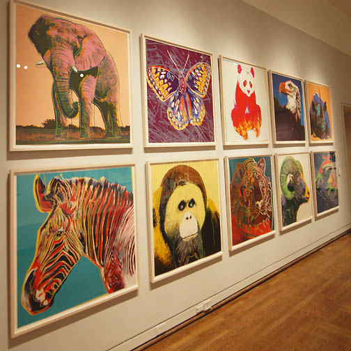 Endangered Species series (1983) RA: Then what does Warhol do he takes this dead image of an animal and makes it extraordinary beautiful and many people did not know that Warhol owned a fair amount of acreage at the tip of Long Island. Montauk... and he's very concerned about it. To conserve it and he ceded some of it to a conservancy because he thought it was so very beautiful. I should get this quote to you because you will think”Andy Warhol”? He talks about the land and he likens it to a work of art and preserved in its beauty and the art is not at the same level of importance. You think, My God... it is very personal; JJ: You really see it in the Sunset series... they are near the Endangered Species series but I would have played them off one another other more in the install. Its easy to see these things once a show is hung already though. Maybe another part of this naturalism is from his Slovakian heritage? Where nature is a big part of their culture with flowers etc? They took extreme pride in the natural beauty of things... RA: The flowers are double edged too... JJ: Always. But growing up in Pittsburgh during the depression you are going to appreciate nature more too... here in Oregon we have such stunning nature with easy access. I feel we take it for granted. That said Warhol's Sunsets are the closest thing he does to addressing the sublime and they are best as a complete series, all of his work really. The flowers too. RA: The flowers series have all sorts of connotations. They are lilies. They have connotations off glory. Fame and death. With Warhol there's always another side that open sup so that they are decorative and beautiful and also death. The memento mori of the wilting flower... its beautiful then it is gone. Life is short then you are dead. 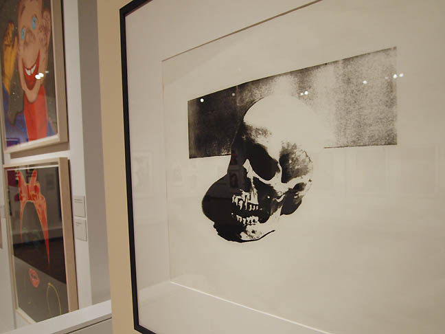 Skull (1976) and Howdy Doody (1981) JJ: it seems like such a short, facile statement to make... that life is fleeting because of death but it is also one of the most profound observations. Sometimes I hear it reiterated that humans are somewhat special as a species because we are aware of our own destruction? Partially, as everyone and every culture is defined by how it handles death but Americans are interesting humans since we kinda ignore death. Warhol pierces the American psyche a bit by giving us decorative flowers and celebrities that bloom and fall away but ultimately its as quick or as deep as you want it to be. He isnt oppressive the way other artists are about Death. Warhol's familiarity with death is more casual like a neighbor or someone you see every day. Gerhard Richter, Jasper Johns, Richard Serra, Damien Hirst and even younger artists like Terence Koh all are more oppressively formal and feel like solid doom. Warhol is so American because with him capital “D” Death is there but lets the viewer treat it as no big thing if they want. When Warhol does a skull or a president he isnt so heavy handed. That awareness of mortality is embedded into his work 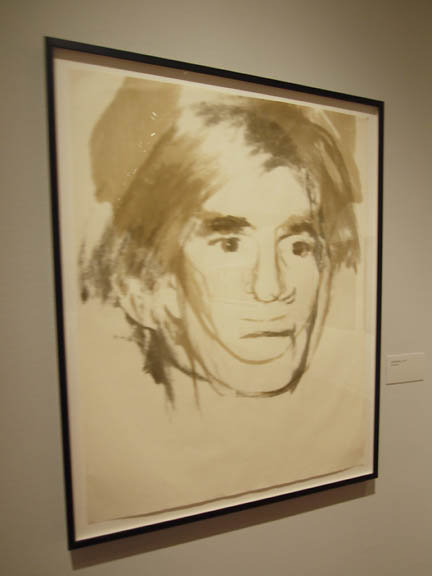 Andy Warhol, Self-Portrait, 1977 RA: The shadows and the self portraits. There is a series of self portraits that you seldom ever see from around 1977 and they are downstairs. Those are so haunting and deeply psychological. JJ: They remind me so much of Shakespearean images of actors playing Hamlet, Lear, Macbeth even Prospero... they are all delivering soliloquies. RA: Even the more familiar ones with the thoughtful glance are very very personal. They are just haunting images of a man whose thoughts are to deep to even speak about. That the Warhol who isn't the guy at Studio 54... but it is one and the same. Posted by Jeff Jahn on October 16, 2016 at 12:06 | Comments (0) Comments Post a comment Thanks for signing in, . Now you can comment. (sign out)
(If you haven't left a comment here before, you may need to be approved by
the site owner before your comment will appear. Until then, it won't appear
on the entry. Thanks for waiting.)
|
| s p o n s o r s |
 |
 |
 |
|
 |
|
 |
|
|
|
|
|
|
|

|
Site Design: Jennifer Armbrust | • | Site Development: Philippe Blanc & Katherine Bovee | |