|

|
|||
|
Portland art blog + news + exhibition reviews + galleries + contemporary northwest art
|
||||


The Tharp Effect: figuring Tharp, Fidler and Wall 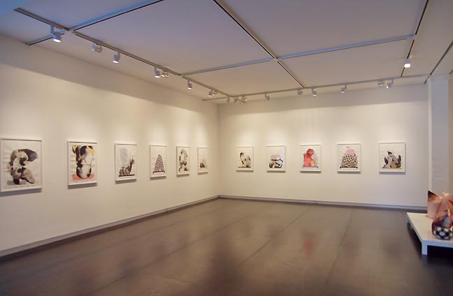 Installation view of Storm Tharp's Holding a Peach (works on paper) All photos Jeff Jahn Over the years, certain artists make technical and conceptual breakthroughs that connect so profoundly with others that it opens career possibilities for other practitioners with even tertiary similarities. I call it the boat and the wake. Coincidentally, the wake gives an indication of the speed and draft of the boat. Historically there have been boats like Claude Monet's Haystacks, Matisse's Fauvist paintings, Picasso and Braque with Cubism, Warhols soup cans, Jackson Pollock's action painting, Judd's 1964 solo show, Andreas Gursky's photographs and the Royal Art Lodge's dark little cartoons on paper. All of which ushered in new eras of appreciation and collecting patterns. In 2007 Storm Tharp had his breakthrough show We Appeal to Heaven (which I was inspired to write the defining review for... 5 years later it still gets a lot of traffic). At that time figurative works on paper were already common due to the Royal Art Lodge's own boat effect but Tharp's show did something different than their more illustration driven work. Tharp's show went from cartoons to portraits and seemed to encapsulate the fragile fiction that is mortality without being an illustration and wet on wet techniques were part of it. 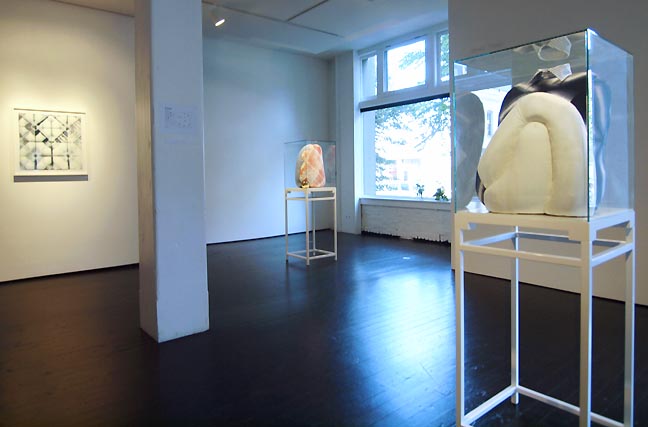 sculpture gallery for Holding a Peach In Portland this month we have at least three on paper portrait artists, including Tharp himself (Anna Fidler and Samantha Wall are the other two), whose work must contend with the bar Tharp set back in 2007. First, let's revisit. Tharp's figurative works on paper in 2007, combined both fine lines and portentous clouds of ink that hinted at both entropy and libido. They were a revelation of fragility, grace, flawed perfection and instability. So much so that by the time Tharp was included in the 2010 Whitney Biennial everyone was doing it, though in many cases it was a just a stylistic affectation. After all, it is comparatively easy to copy what others have already done, even if Storm Tharp is a virtuoso. Sadly, most people can't tell the difference between A- and A+ work (A+ also gets very expensive) but put your face within a foot of a Tharp and you can see it. The line and ink effects are more relaxed and less twee. In short it is less of a stylistic inclusion than a personal vocabulary that had imposed itself on the artist in the studio, well before before he himself fully accepted it. That is often a good sign. You see, Tharp is the sort of artist that though gifted with prodigious abilities, is also wary of becoming formulaic or utilizing craft as a crutch that cloys for attention more than the heuristic whole of the work. He may be the best portrait artist the Pacific Northwest has produced since Chuck Close, but he will always be judged against that 2007 show, just like everyone else who does figurative works on paper in the area is. 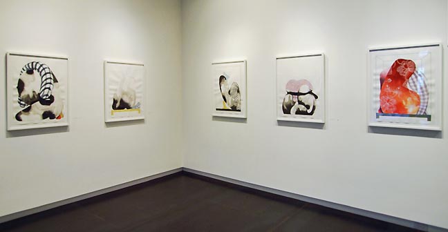 Holding a Peach (works on paper gallery corner) Fast forward to 2012 and we have Storm Tharp's latest exhibition, Holding a Peach. It is a show with no faces and a more limited use of the wet on wet ink cloud device, which even morphs into a kind of tongue in cheek tie-dye with a little Japanese paper folding thrown in. It is a rejection of standard portraiture in favor of posture and the psychological texture of clothing that evokes classical (ie ruined) Greek sculpture. It is an ingenious way to show everyone there is more going on here, while willfully refusing to recreate 2007. Thus, more than any Storm Tharp show, Holding a Peach is work about the body and the way that form is animated psychically. There is a certain yoga to this work. Overall, Holding a Peach feels more intimate than any other Storm Tharp show and I even suspect there are perhaps only one or two models, whereas the 2007 show was a show related to a mock-epic cast of separate characters that that Storm constructed somewhat from a circle of acquaintances. The title itself, Holding a Peach should also confirm to everyone that is a show about the body. It is even separated neatly into two galleries, one mostly for drawings the other mostly for sculpture. 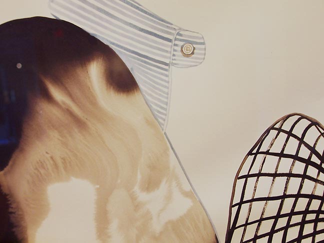 (detail) Spring Picture (Strut with Collar) 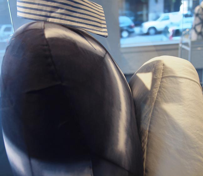 (detail) Strut With Collar & Folded Legs The dichotomy works. For example, the work Strut with Collar (Spring Drawing), utilizes the ink as a kind of tie dye torso... it seems like a study for the sculpture Strut With Collar & Folded Legs which notably switches the more chaotic sumi ink clouds for a geometric tie die created from a complicated folding process. I'll go on an educated guess that this figure is Tharp himself because he favors these kinds of collared shirts and that deep prussian blue color. Even the form resembles Tharp's body posture, specifically the forward slump he carries his shoulders. If it is Tharp (and intentional or not, it is) the figure has a certain calm sense of repose while presiding over its gallery, while looking into the one across the hall (a device he used when curating the Lumber Room). That sculpture, along with the Young & Old are the two most successful in the show but overall the quality of all the work is very high, beaten only by his 2007 show. Though Holding a Peach lacks the overwhelming punch of Tharp's awe inducing portraits with faces this is perhaps my second favorite Tharp show. I even recognized the bronze "struts" in the sculptures as similar to the saddle like leather sculpture he showed in the 1999 Oregon Biennial (the most influential group show in Oregon art history). 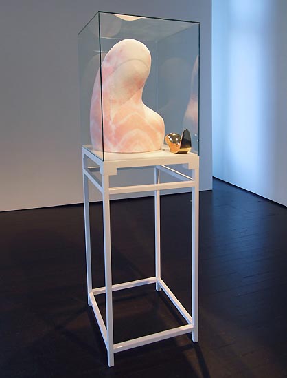
Young & Old Perhaps it is because there is this two room commentary between the works on paper and the sculpture that has to be teased out? A lesser artist would have put the related works next to each other. Speaking of relationships, over the years I've mentioned the correlation between Francis Bacon and Tharp's work. Yes, besides both being gay there exists a designer's finesse, obsession with the body, grotesques and a fascination with containment for both artists. But if there is a difference between Francis Bacon and Storm Tharp it is that Tharp has a consistently better eye for clothes and hair and he celebrates it. That isn't a putdown, it reveals a dramatic difference between the two. In fact, Tharp is the more comfortable at finding personality in the way the chosen patterns of hair and clothing speak (we can't choose our skin but we do have options when it comes to clothes and hair)... whereas, Bacon makes his figures gruesome... portraying them as if on an excyclema. By comparison, Tharp imbues his with a more tender, even poeteic entropy that is a lot less calloused (or British). In short Bacon creates elegant rooms for inelegant figures... Tharp plays things closer to the heart and sleeve, it's emotional work and he likes to play host for the viewer rather than shock them. This makes Tharp less sadistic and more a student of beauty (and asian traditions), which after Dave Hickey's The Invisible Dragon essay gained renewed value. I'd also say there is a Brancusi like fetish of the plinth in the sculptural works. Also, the vitrines resemble Damien Hirst or Marc Quin just a tad too. Still, neither Francis Bacon nor Damien Hirst was/is capable of making soft sculpture like this and instead the soft forms seem to bring a mortal quality that most sculpture does not posses. The sculptural work is a show of mostly soft curves and a little metal. It is sensual work that seems to signal a new-found confidence in Tharp who is innately skeptical of himself. I find the use of fabric interesting because Tharp has been designing clothes for a very long time and by channeling it into sculpture he's avoided becoming a brand label... retaining his artist's elan. It is a complete reversal of being a clothing designer. 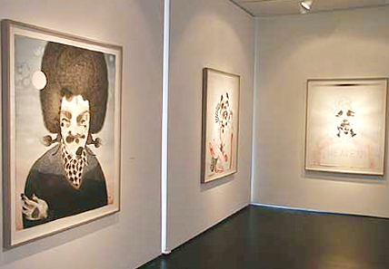
Installation view of Storm Tharp's We Appeal to Heaven (2007) Holding a Peach is a subtle outing and some of the drawings are a bit flat (because they were preparatory for the sculptures, which are more consistently successful). Overall these works are not as immediately stunning as the portraits with faces whose dictatorial countenance comes with the face making genre, but this softer take on broken classical sculpture meets the viewer like a warm firm handshake. The effect is still emphatic but incapable of being overbearing. In short, Tharp is doing well living up to himself while revisiting his themes more indirectly. Of the artists practicing portraiture today he is one of the most discreet. All of this is contrasted with two other Portland portrait artists who must necessarily deal with Tharp's preeminence. 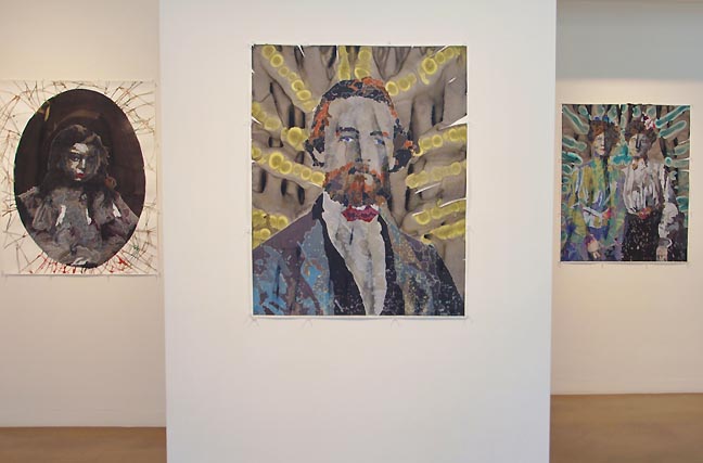 Anna Fidler's Wolfmen and Vampires at Charles Hartman Fine Art In 2009 Anna Fidler morphed from a psychedelic landscape artist to one who made very finely wrought psychedelic portraits. When she initially chose the Portland Trail Blazers basketball team as a subject there was a collective huh?, not because of the professional sports connection but because it was such a blatant attempt at attracting an audience and dangerously close to the dreaded panderings of LeRoy Neiman. Still she's got something that resonates locally. A portraitist has to walk a fine line between perceptive flatterist or caricature illustrator as they are very dependent on the subject they chose to represent. Let's just say the 2009 Trail Blazers were not the Night Watch. Now Fidler has found an infinitely better subject matter... creepy old photographs of prominent and not so prominent Oregonians. Her new portraits at the Portland Art Museum's Apex Gallery and Charles Hartman Fine Art use tons of fine line as well as the Tharpian wet on wet psychedelic pigment clouds in antiqued tie dye patterns. It is completely different from Tharp as a kind of haunted or much higher end McMenamins paranormal fetish, whereas Tharp doesn't disclose much of his source material (just part of the reason he's a stronger artist). Still, people do love creepy stuff and I like the way Fidler's Vampires and Werewolves (as she calls them) references aboriginal art, gothic horror and Jeremy Blake. All deal in the spirit realm, but there is a campy quality that just doesn't sit right. Don't get me wrong, the work has merit, though perhaps way more stoned and twee than Tharp would ever attempt but it also catches the wave of Coraline, Grimm and Paranorman or the "haunted Portland" motif with penache. There is an applaudible intensity of craft here but it lacks Tharp's easy looking mastery by making a huge show of how much effort went into it (Portland fetishes craft as indiscriminately as it does community, but THERE ARE different levels of craft and community). 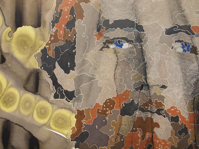 The Colonel (detail) Yes, Fidler's work is better than most similar things I've seen elsewhere. Still... I feel like it is riding a wave, rather than creating it. This isn't a huge indictment... everyone finds their level and if Fidler stops flattering Oregonians I can see this work finding a national audience with the NADA level gallery crowd. My criticism is admittedly unfair but it invites a comparison between the two artists; Tharp is brilliant, whereas Fidler is simply very gifted but needs to commit to her subject matter more so she can stop being defined by her subject matter. For example The Colonel inherits that creepy spectral gaze one finds in historical photos but it's the gimmicky trippyness of the background which gives the work both a gee whiz quality quickly followed by viewer's remorse. It is striking at first but upon extended viewings it suffers. That said Fidler has a knack as a creepy colorist and her treatments of the eyes and hands are excitingly weird. 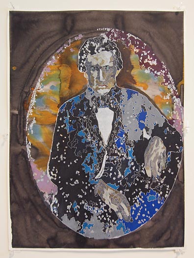 Mr. George Just check out: Mister George... he flickers with an eerie intensity that is intensified by the way Fidler gives his eyes and hands a preternatural light. Whereas, Young Girl From Silverton seems to wear as a costume... it's rampant Victoriana taken just a little to far (unless you love that sort of thing). Perhaps it is the near steam punk psychedelia in most of the works that gives me reservations, though I do like this both the Apex Gallery and Charles Hartman Fine Art exhibitions. It just seems like the works succeed in a predictable way (Tharp has more failures and monkey wrenches... but the payoff is higher). Perhaps Fidler should get out of the past and use living subjects so she can utilize insights she might have?... perhaps she coulsd even work in her gift for odd psychic landscapes in the background? That would give the work a more beguiling Mona Lisa quality? Or perhaps go the other way deeper into both the past and fiction? I don't doubt Fidler's talent, just the gambits she is choosing and the way the work succeeds. 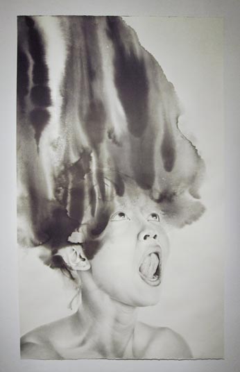 Samantha Wall's Clarion Call The third artist in this Tharpian trio, Samantha Wall is also the youngest, being a PNCA MFA grad in 2011. In fact, when I saw her 2011 work I considered her the single most complete PNCA grad I've encountered... that's partly because she been kicking around the scene since at least 2006 and isn't some 25 year old know it all, she is a seasoned pro who boasts a Joan Mitchell Award. She deserves a studio visit from most of the gallerists and curators in town. Wall's thesis work was more related to Vija Celmins and Robert Longo so I was a little disappointed to see the Tharpian turn of wet on wet sumi ink in her show Partially Severed at PNCA. Her line is so good she really doesn't need the ink smoke effect. Being influenced by the depictions of women in asian horror cinema Wall's current work in Partially Severed is more macabre than anything Tharp or Fidler have ever done but it is also a little less shocking than the source films that inspired the work like, Ringu, House and Ju-on: The Grudge. That's the danger in subculture mining, you risk being underdeveloped in comparison. Still, the asian horror film genre does highlight mutilated women with creepy facial expressions with quick cut close ups and a lot of detail so I see the parallels to Wall's earlier grappling women works that proceeded this work. Perhaps it is the way Partially Severed lacks the suspense of those films or the tension women locked in hand to hand combat like her very successful MFA work. In one work, Clarion Call, the end result looks less like asian Horror than a detail of Jane's Addiction's Nothing's Shocking cover art. Another work Furies, reminds me some of Tharp's early Franz Xavier Messerschmidt studies... which is fine because most portraitists end up going through Messerschmidt. Somehow I fully expect her to roar back with some incredible work after this. 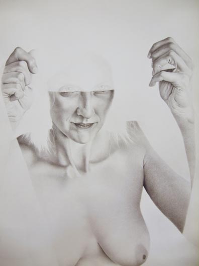
Detail of White Lady (Detail) In fact you don't have to wait, her piece at Foco Gallery's Portrait Project show... Wall's White Lady (Detail) is absolutely stunning. Her depiction of gauzy fabric as a partial reveal and as distracting negative space camouflage is remarkable. In fact, it reminds me why I consider her to be the only artist who can match both Tharp's skill and figurative IQ on paper in the region. It helps that the piece has nothing to do with Tharp's use of ink effects. What does all this tell us? First, these three artists aren't that similar in their aims and will likely diverge more. To be fair there are other artists more guilty of copying Tharp than the ones discussed here. Rule of thumb, if you are copying Storm Tharp more than Storm Tharp is, it is a problem. Second, Tharp is handling himself very well, finding a way to keep his work relevant and fresh. It also tells me that Anna Fidler knows how to play the Portland game (is she willing to up the stakes beyond that?). Samantha Wall is still an unknown but potentially huge force in figurative art in Portland that still needs to find her stride. After all, she did after all graduate just a year ago. It is true, nobody owns the wet on wet technique but hopefully, drawing attention to the Tharp effect will help others deal with it as well as Tharp himself has. Posted by Jeff Jahn on September 13, 2012 at 16:06 | Comments (0) Comments Post a comment Thanks for signing in, . Now you can comment. (sign out)
(If you haven't left a comment here before, you may need to be approved by
the site owner before your comment will appear. Until then, it won't appear
on the entry. Thanks for waiting.)
|
| s p o n s o r s |
 |
 |
 |
|
 |
|
 |
|
|
|
|
|
|
|

|
Site Design: Jennifer Armbrust | • | Site Development: Philippe Blanc & Katherine Bovee | |