|

|
|||
|
Portland art blog + news + exhibition reviews + galleries + contemporary northwest art
|
||||


Virtuoso Vindicated: Storm Tharp at PDX Contemporary 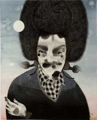 The Duke of Albuquerque (2006) For years Storm Tharp has been haunted by his good reputation; nice guy, smart, worked for ad giant Weiden + Kennedy, ability to draw like the devil himself, etc. The problem was always the way his talent just spilled out in all directions and mediums at once. It was as of his supernatural abilities had come along with a supernatural dose of attention deficit disorder. In 2001 I mentioned how good he was to a local critic and they scoffed, "well there are new artists in town to pay attention to." But luckily talent finds a way and after September 11th, works on paper (Tharp's strongest suit) were suddenly hot again. It's true though, there was a lot more competition from a flood of new MFA's streaming into the city (which continues today). Tharp needed to do something, so he quit W+K and dove headlong into focusing on the work. It has paid off spectacularly, with a show that puts any other contemporary portraiture show on paper in LA or New York to shame, it's just that good. It's also very personal, psychedelic, risky and honest in a way that most shows in those cities are not. Titled, "We Appeal to Heaven," the show consists of a series of highly mannered and grotesque portraits. All are the same size: 59 1/2 x 48 inches. Although the show title suggests old master European art Tharp was equally inspired by the elegant but studied spontaneity of Chinese ink drawings as a technical benchmark. As a traditional art form it is the quintessential study of how to mix risk with rarefied control but in Tharp's hands it's a lot looser and has to share space with a rotating pinwheel of other techniques. The resulting melange of half length portraits is trippy, hypereal and loaded with dandified clown details. Each character is artfully well dressed in notable outfits while their skin belies a blemished mortality, treating human flesh like a transparent sack of water that has been blotted but not completely ink soaked. Are Tharp's subjects; lepers, the bloodless dead, a freak show, a royal court, saints, the diseased or simply characters wearing their fiction?... yes, probably. In each image the hair goes beyond fashion magazine complexity and coveys varying sense of primal energy in storage. Some have great supplies of elan vital, while others are dwindling; one (Rare Bird) has transcended the issue. 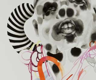 Eu De Toilette (detail) Oddly, these grotesques come off as collage though they are watercolor, colored pencil and ink. Alone each element would look too precious but here the cancerous ugliness of the skin gravitationally keeps the clothes, hair and posed form in a coherent orbit. It all invites the viewer to create a narrative, so I will: The most confident of these characters is The Duke of Albuquerque. His penetrating gaze, forward crouched posture, flared nostrils and impressive 'fro all say, "I'm in charge." His features are sneering and warped. A man of ambitions perhaps? His clothes are fuzzier and thicker than other characters, just like his hair. Is the hair a sort of armor to defend him against the cold winds of change? Is this duke the next king? Probably not yet but he see's an opportunity though. 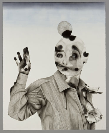 The Ex King (2006) I'm assuming the change at court is taking place because The Ex King is leaving the scene. His immaculately crisp pressed shirt is the most amazing bit of pin striping and reminds me of the best work of Robert Longo; it radiates power and crushing vulnerability at the same time. The former king has only a small queue of hair left and he's waving his way off the stage. The posing of the hands says resignation and graceful departure. The eyes say sorrow and possibly exile. The sorrow indicates this was not by choice. Still the character achieves a state of grace after losing his defining power. Apparently when stripped of influence the emperor had his dignity as clothing. It is my favorite piece in the show, utterly touching. Eu De Toilette is the court jester. Like any good grotesque the bald baby headed character is covered in stylized penises while showing his teeth. There is something really disturbing about the baby's head created out of sickly ink blots, an unholy union of youth and decay that most Americans, especially gallery goers are not too familiar with. His presence is amusing and seemingly inconsequential. He steals the show, but my favorite piece is still The Ex King. The Counselor is anything but inconsequential. He is a Francis Baconeque figure seemingingly bursting into smoke at the head and heart from the secrets he holds or has told. The striped Polo shirt says he's not at work but then again he's always at work. He has been twisted by his role. The listener who is nothing but smoke at the core. Terrifying. Four characters remain comfortable and less corrupted. Einstein is the court painter/inventor. He wears the purple hair we saw in Tharp's Elizabeth Taylor tantrum pieces we saw a few years ago. He wears the unfinished and colorful clothes of an inventor. The face is satisfied and amused. This is the closest thing to a self portrait here. Rare Bird is a wizened sage old woman. As I mentioned earlier, her hair isn't just hair, it has become a flower, like the one draped around the Ex King's Neck. She wears a gold necklace that tumbles down her torso like a waterfall, spreading out. She has transcended the scene. 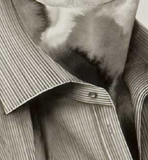 The Ex King (detail) Thin Ann seems like the requisite waifish girl that gets drawn into such sorry court intrigues. She is the character most related to anime and has a kind of vulnerable pathos that seems more realized in the final character, Jeremiah Puckett. He's the outsider with long blue 70's hair, grief stricken face and a 70's T-shirt with the word Heaven emblazoned on it. Above him a band of poltergeistic energy is darkening. Is he going to heaven? Is the shirt literally heaven? It's totally inconclusive and this is the character in the most supplicant of poses on view. All of the characters are certainly appealing in their flawed states, but only two, Einstein and Rare Bird have their drives and essentially conflicted natures harnessed to constructive ends. Previously Storm's work has relied too heavily on text (such as some of the works facing the outside in the gallery windows), too affected like his The Prince's Theater or too obvious like his face as a vase of flowers in the 2006 Oregon Biennial. This show harnesses Tharp's multi-faceted interests and conflicting moods in each work and lets the viewer assemble the puzzles and narratives. The images themselves are as beautifully disgusting as they are slippery. They are as debauched as they are transcendent. This is premier work and a virtuoso has been vindicated. Awe inspiring stuff, this work changes people's outlook when they see it... suddenly the world looks both better and far worse. Posted by Jeff Jahn on January 10, 2007 at 16:30 | Comments (4) Comments I was very anxious for this show, and I am equally anxious that it didn't disappoint. This show certainly solidifies Tharp's "good reputation." I tend to agree with you that Storm's weakest works are the text based works, but being a designer myself, I can understand why they may be necessary to include into his work. I have been a Tharp fanboy for quite some time, and I can see that will not be changing anytime soon. Posted by: Calvin Ross Carl This show was astonishing. I also liked the effect of seeing a continuous body of work, united by size and materials, although I disagree that any of Mr. Tharp's previous efforts were diluted by his forays into other media. I'll dare to characterize the Northwest as an anomaly in that we (the art-viewing public) seem to expect artists to specialize far more than other places. Not only is this an ultra-commercial model, but it's conceptually limiting to cram an idea that might work best as a, say, quilt, into a ceramic sculpture (if that's what you're known for). While I certainly value the attention to 'craft' in our community (OCAC grad, thank you), and I think it brings a strength missing from so much gimpy NY hipster crap, I for one would love to see more cross-media experimentation. How many times do I pick up a First Thursday guide and know what half the shows are going to look like without even going there? Now, certainly there is a commercial pressure to this. "If you can sell it in Portland, you can sell it anywhere." Artists are thrilled when they hit on something good, and want to keep at it, but that's a project, not a career. Change is important (to paraphrase Paul Chan) so that you don't become Robert Indiana. Mr. Tharp has shown he can make a knockout painting show, and I doubt he cares what I think, but I hope he keeps his unpredictable and exploratory edge. Posted by: inexile I would never characterize his earlier shows as diluted, instead I would say it was serving too many masters... a fine hair to split to be sure but an important one. What Storm did with this show was harness those many masters into each piece. It is true, "work on the wall" is pretty commercial and the show has sold very very well but there is more going on here... I think it is because portraits on paper are his strongest suit. These drawing/paintings seem to encompase all the facets of his work... and while I love some of the sculpture (Maybeline is the fav) there is something more cloying about that work. Its just my taste, I like work (and people for that matter) which dont pander to my expectations. Tharp's latest drawing are pretty wierd (Robert Storr needs to see these) and that alien aspect makes them attractive, not their focused format. I think the focused format was more useful to Tharp in the creation process. Yes, it also helps even the most neophyte audience "get it" but for me that is usually a minus. This show manages to be great and surprising depite being monogenic in format. I also think that future shows will be able to work sculpture etc. in and still be coherent. Storm's one of my favorite artists to talk to (almost always on some random street corner) and I just sense that a light clicked on when he did that "Trust" piece and showed it last year... it lead to the works in this show. Every exceptional artist has a moment when it all falls together and you can tell because the room practically sings. This is one of those times.... enjoy Ive only seen 4 other solo shows in Portland by Portlanders that were of this caliber: Linda Hutchins' Line Drawing 2006 (Note half of those shows were not monogenic in format... it's always a tough question for an artist... do I focus it on one fomat or do I do a kaleidoscope) One thing is for certain, it's never an accident when shows of that caiber come together. Posted by: Double J I definitely got the good ole "singin'" feeling when I first walked into Storm's show. I think it's weird how they showed his text works in the windows of the gallery, but I guess they served as good teasers. My girlfriend (who really isn't much of an art geek) poked at the pillow on the floor of the gallery and said "Aren't pillows supposed to be soft?" I just replied, "Why yes they are." On a different note, am I the only person that didn't necessarily understand Kay French's show at Pulliam? The way she describes the work sounds very intriguing but I can't feel it in the work. Just me? Posted by: Calvin Ross Carl Post a comment Thanks for signing in, . Now you can comment. (sign out)
(If you haven't left a comment here before, you may need to be approved by
the site owner before your comment will appear. Until then, it won't appear
on the entry. Thanks for waiting.)
|
![[TypeKey Profile Page]](http://www.portlandart.net/nav-commenters.gif)
| s p o n s o r s |
 |
 |
 |
|
 |
|
 |
|
|
|
|
|
|
|

|
Site Design: Jennifer Armbrust | • | Site Development: Philippe Blanc & Katherine Bovee | |