|

|
|||
|
Portland art blog + news + exhibition reviews + galleries + contemporary northwest art
|
||||


Jacqueline Ehlis at NAAU (Abstraction Today, an anatomy) 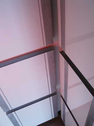 After Hours Red (The Red Corner), [view from above] Since it has opened Jacqueline Ehlis' Serenade at NAAU has become one of, if not the most demanding and discussed exhibition I've experienced in my 9.5 years in Portland. Its avowed goal is simply to "operate within the historically loaded perimeter of painting," but it's not the spectacle many expected. Instead, it presents itself without fanfare like a monk in a monastery; it is quiet, task driven, ascetic, up front and unpretentious. It carries itself around with a lot of discipline and deep seated routine that tells the viewer that this isn't just an art exhibition but a kind of anatomical treatise on monochrome geometric abstraction and minimalism's connection to surface and material. Now in its last weekend with positive reviews from every outlet in town and a nonstop sustained level of tongue wagging it's time for a deep look. Overall, Serenade probably wont be Ehlis' definitive exhibition but it does clearly signal she might be much more than a just a very good artist… perhaps even a uniquely challenging one that puts content and the viewer's experience over signature style. 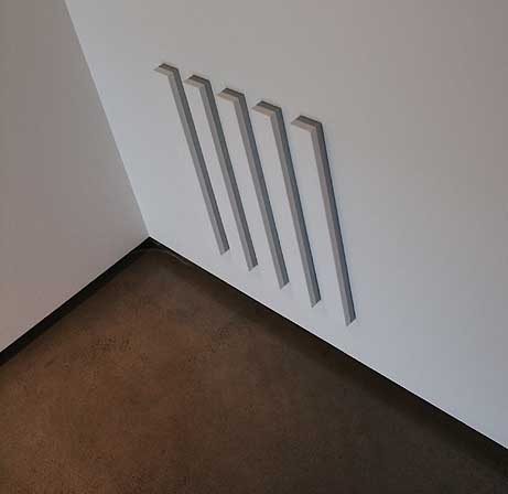
Tell Of One Thing More [balcony view] What it is and isn't: Serenade is theory driven; George Kubler's landmark The Shape of Time looms large here (because of it's nonlinear focus on human desires supplanting periods and styles). Yet instead of some academician's pet the exhibition feels contemplative, like a monastery library window with a garden view of art history. That positioning reveals stylistic conceits imbedded in materials and challenges theoretical precedents without breaking from the studio routine that birthed it. It also feels experimental (possibly to a fault at first but improves with time) and its single minded questioning reminds me of scientist/priest Gregor Mendel whose work with pea plants lead him to discover genetics. She's onto something that can be explored for a lifetime. That said, painters generally don't discover things, they reveal them and it has been a long time since I've seen such a sustained program of inquiry… it is reminiscent of classic Jo Baer, Robert Ryman, Ellsworth Kelly or most recently Bernard Frize… with important differences of course. For example Robert Ryman's most famous quote is "There is never any question of what to paint only how to paint." It's true, that seems a bit one dimensional today but Ryman made those constraints work by avoiding the spectacle of style that is "what" and focused on "how". To be groundbreaking today you probably have to do both, though most in today's market driven art world focus on the what. 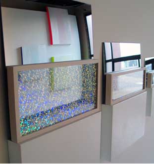 Delightful Exhaltations (detail) Compared to Ehlis' contemporaries "Serenade" makes Grotjahn, Abts, Davie, Yek, Reyle and Mehretu (all artists I like) look more like stylists focused on what to paint. Many even fetish the layers they do or do not develop in the studio. Only Anselm Reyle or Bernard Frize seems to have similar level of inquiry into "how" but Ehlis is more like the architect Rem Koolhaas in that the "how" is driven by an idea presented as material effect. Thus the idea is designed to be translated and rendered as material, becoming the delivery vehicle for concepts about kinesthetic experience. What is great is you don't need to know about the initial idea to have the experience, but its there if you want to consider it. Dissimilarly a painter like Frize is all about process not the viewer's experience. These are bold claims not made lightly, but time and again the works in Serenade are designed to make you look and do funny kinesthetic dances from different angles to view the work. That viewing dance is something that the work of Julie Mehretu, Bernard Frize, Mark Grotjahn, Anselem Reyle and Tomma Abts does not provoke. Karin Davie's work produces a woozy drunken effect that is somewhat related as experiential art but it's driven by a style (that I love). Instead, Serenade has a surgically detailed effect… a different dance all together. I'm not even sure I like Serenade as much as Davie's work but I'm thinking much harder about it than I've thought about the work of those other artists because it creates cognitive resonance and dissonance without worrying about an signature style. I can't just file it away and that creates challenges. It is also interesting how a Hickey era UNLV educated artist in Portland ended up looking so European (intensely designed, unapologetically intellectualized and unobsessed with stylistic novelty as a brand). Maybe it's the fact that this Couture stipend series show allowed her to sidestep her own healthy market and concentrate on things other than salability. It's an artist's artist show and it holds court. In fact, court is a good word here as each piece as a role or unique function to serve in the gallery space and compositions have more than a passing relationship to heraldry as well as the life's work of Donald Judd, Agnes Martin, Dan Flavin, Joe Baer, Robert Ryman, Robert Smithson and Barnett Newman etc. The exhibition: 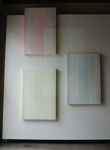 The Cinema Of The Blushing Skin The initial piece "The Cinema Of The Blushing Skin" is like the ghosts of three Barnett Newman paintings painted in powdered sugar, though it's a more delicate European look than the earlier American's harder edge. The red yellow and blue colored stripes are barely discernable and a video projector faintly ties all three canvases together with detailed still images from Venice that read more as texture than discernable scenes. This equates the painted texture with mechanically translated and projected photographic texture, building upon Ehlis' brilliant "Necessary Abstraction" photo(as)paintings from her previous show in 2005 which evoked Steiglitz's "Equivalents."  Cinema Of The Blushing Skin (detail) But it is different; this latest foray explores the limitations and possibilities of mechanical and natural projection instead of the potentials and quirks of photography's mechanical reproduction as a translator and redistributors of imagery. Instead, the projections which shift every ten seconds operate like a bride's veil while the fluorescent northern sides of the paintings create glowing halos against the adjacent exposed cinderblock. Thus, the paintings project photons just like the projector, a deft multifaceted look at how paintings operate... and a 21st century expansion of Jo Baer's earlier and more traditional explorations of the canvas' edge. Here the edge is the architectural environment. Question, are paintings that paint other walls with photons still technically ascetic and inward? There is a precedent, Dan Flavin did it all of the time but the difference here is the work only reflects back the light thrown at it. Then there is the fact that these paintings peskilly show up in the reflective surfaces of others works in the show, a kind of opera box voyeurism without a play to distract from the proceedings. 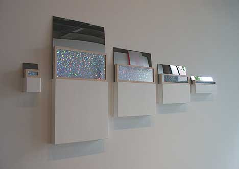
Delightful Exaltations The five part piece on the adjacent wall "Delightful Exaltations" is the most theory driven piece in the show with five sequential white shelf/paintings (painted the same white as the wall, thus co-opting the whole thing). It is often nice when there is just one work on a wall but in this case it is essential because it co-opts the entire wall. Reading from right to left the painting/shelves become increasingly taller so that combining segment #1 and #2 will give you the volume of #3 etc. This is similar to Robert Smithson's Alogon #3 and the pieces mirrors atop certainly reference Smithson (very influenced by Kubler himself) but that's where it ends. Instead of a Smithsonesque disorienting pattern Ehlis has created barely discernable white lines in the painting portions which echo the textured lines and relief of blushing cinema pieces across the room. In addition the mirrors reflect the cinema elements as well. So instead of Smithson's nonsite Ehlis has created a matrix of orientation and sympathetic correspondence involving the viewer in the process. This ties in well with our times where technology is uses to connect things rather than disconnect or monopolize them (like TV watchers in the 70's). 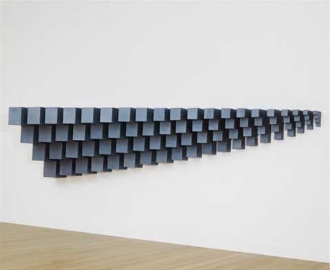
Robert Smithson's Alogon #3 1967 This piece by Ehlis gets even trickier…. Each white piece from right to left seems to be hung a few millimeters shorter than the other. It's something one feels before cognition and trained eyes can perceive it, which sets the viewer up for the final part on the left side of sequence, a small square that breaks form. By breaking the cadence it acts like period at the end of a sentence and seems to interrupt the volume grammar of the piece… but it doesn't. Instead, the square shifts the awareness from the individual elements to the entire wall because it echoes the exact floating distance between the wall and the floor, reaffirming the pieces connection to the rest of the room… basically rewarding the viewer for paying attention to the gestalt of the room, a slightly twisted Juddian statement without restating Judd (which is hard to avoid). Directly across from that piece "Flush, Poise and Immerse" restates Newman, Ellsworth Kelly and Robert Irwin's obsession with red yellow blue. It's fine but the least interesting piece in the show, while hearkening back to Richard Tuttle with its use of paper and Ehlis' own Lifted series from 2005 which was recently featured in Dave Hickey's Las Vegas Diaspora show last year. The lifted series is more successful. Sure the stainless steel forms here are more lively than the previous series' appendages but the red, yello,w blue thing was already stated in "The Cinema Of The Blushing Skin" making this work somewhat unnecessary in the show. The same cannot be said of the next piece, "Tell of One Thing More Than This." With 5 skinny horizontal white canvases painted with the wall's white in addition to a grey metal reveal between the canvas and the wall it's a study in directness ala Agnes Martin's horizontally striped pieces and Donald Judd's reveal… equating the two most proteanly direct artists who are likely to ever walk the earth. It's a tribute piece that would seem perfunctory without all of the other company in the room but in this context it's a highlight. It reemphasizes the room's gestalt as a set up to reconsider what one has already seen. 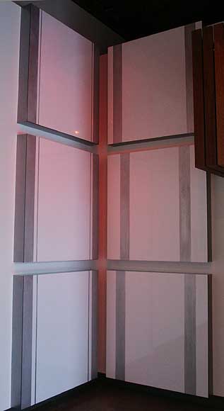 After Hours Red (The Red Corner) Which makes the last piece in the show After Hours Red (the Red Corner) so satisfying. Based on the Russian tradition of the krasnyi ugol or "red corner" where icons are kept, the six square aluminum panels are the largest piece in the show, are tucked in the corner. These 6 reflective panels have the same sleek finish as a private corporate jet but also evoke the slatted stave architecture balcony above them with their Barnett Newman - Joe Baer - gran tourismo style stripes. Their thickness also echoes the volume between the floating walls and floor again too. 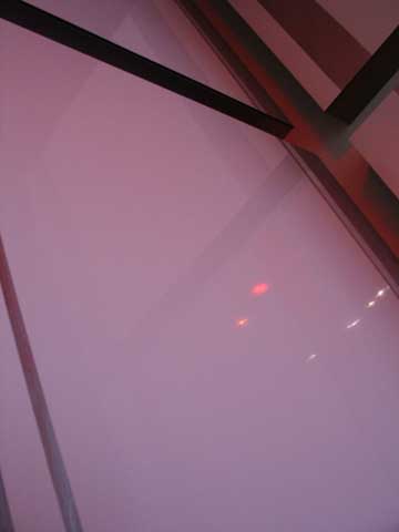 (detail) After Hours Red (the Red Corner) What really makes the work sing is how it is lit with red lights. It's near impossible not to catch a reflection of yourself in the work and of course that reflection is red. Thus, these are paintings that paint the viewer, a neat rearrangement of the role of artist, painting and viewer and a fitting closer to the show. Final Thoughts: Overall, Serenade is a show about renegotiating the current vernaculars of painting and space, treating them as different but interchangeable entities. Also, with all of the equivalencies in spatial dimensions, white paint and interferential elements the net effect of Serenade is viewer hyper-awareness. Most of Serenade's pieces often act like a big white Loch Ness Monster at large in a lake of milk. Which is to say that the show's boundaries aren't fully understood, even though it's basically just minimalism hybridized to different minimalism… but somehow very different and not reductive. Maybe it sticks out because people sense there is a whole intellectual programme at work designed to make the viewer curious. There is, and it is powered by those same white voids that powered Agnes Martin and Robert Ryman… but behaves a-stylistically like a disorienting detailed Rem Koolhaas building. Thankfully it doesn't produce paranoia but likewise one can't take anything for granted in this show because it seems like everything is so intentional and prepared, like a meal at a top restaurant. Yes, Serenade is a room for connoisseurs but it is also approachable for the uninitiated because it is so direct. Maybe part of the reason people can't stop talking about this show is there is a nagging sense here that the work is better at being viewed than we are at viewing it? Maybe that is what painting needs; a way to feel new and unfamiliar again. But right now it is more like heraldry … meaning that it tells you who it is by historical allusions rather than the more American amnesia of constant newness. The thing is Ehlis has found out how to make that heraldry somewhat unfamiliar again with her much sustained inquiry. Right now she's the most innovative hard edge abstractionist north of Los Angeles and the next show should prove crucial in understanding how much farther she can go and if a more obvious style is necessary or not? Show ends August 10th at NAAU Posted by Jeff Jahn on August 09, 2008 at 11:29 | Comments (5) Comments "Serenade is a room for connoisseurs but it is also approachable for the uninitiated because it is so direct." This directness is a large part of why I enjoyed the show so much. The viewer can can find and understand all the aesthetic subtleties that tie the pieces together, without having a history lesson on post-WWII art. Just a wonderful show. Posted by: Calvin Ross Carl I really found this show satisfying in that it invites such contemplation and curiosity with such simplicity. However, in my "funny kinesthetic dances" around "Blushing Skin," I noticed that it's just the red and yellow paintings that evince that neon glow on the north side. The blue painting doesn't cast as strong a light - AND it is the only one with a visible strip of aluminum behind the canvas (unless I missed something?). I am now dying of curiosity. Why blue? Why is that painting distinguished in such a specific way? Posted by: Megan I just saw the show yesterday, and that same thing stuck in my head. Why wasn�t the blue fluorescent, and why was it stacked upon the steel form? But it is starting to work for me; what was initially an irritant (why the irregularity amidst such a concise and considered body of work?) has become more like the stimulus to the creation of a pearl. Having noticed this at the beginning, it definitely piqued my curiosity and forced me to look at each piece harder, notice more. I found that it drew my attention to the very processes of absorption and reflection of light that creates color, and the fact that the fluorescent colors are actually capable of changing the wavelength of the light they reflect, whereas the traditional pigments only reflect some of the wavelengths that illuminate them�and furthermore, keeping this behavior in mind, what are the physical and affective differences between the same form creates via canvas/pigment or steel? Of course, this doesn�t answer-why is the blue piece in particular different?- I wonder if one might have to look to the physical possibilities of blue itself, or to emotional/philosophical resonances of blue (interesting to ponder this having just seen Jarman�s �Blue� at NWFilm!). Having noticed this irregularity in the first piece, by the time I got to �tell of one thing more than this� what could have felt like a rehash of minimalism 101 felt instead like a revelation, a piece that generously rewards the build up of attention/sensitization that preceded it. And then this was affirmed and deepened by �after hours red�- in which the volume and placement carefully prevents the viewer from regarding the source of the red glow on the edges (and you so want to!) until attention is directed to the color of the track lighting itself. And so on�.the irregularity injects a probing question into the body of work, a thread that makes the whole thing tighter and more dynamic. My question, then, would be what is it exactly that makes this work current? Does it say something new and specifically contemporary about painting, space, and light? Does it need to? Maybe the web of art historical precedents and associations (available most potently in retrospect?) is just another thing like light, space, or material that she is activating. Posted by: jenevivetatiana It is very different from a lot of the first generation minimalism in that it isnt reductive, it's additive... maybe even chimerical. Instead of purity it's about the switch up. It's also not so complete unto itself... it invites viewing... the kinesthetic dances. Ehlis is quirky... her work almost always irritates me right off the bat, then I come back around to it and this show was simply more up front about how it was operating. Posted by: Double J Jeff makes an important point here about Ehlis's work that I'd like to add to. It's not minimalism. (I'm writing based on the NAUU photos, the photos on PORT and Eva Lake's video, all of which I've just looked at.) Remember that even the moniker 'minimalism' was first used to deride the work as a reference to the notion that it required 'minimal work to make it' and that there 'wasn't any there, there'. In the case of Ehlis, I think some might jump to the conclusion that because she has made what appear to be essentially white rectangular solids that it's minimalism. Leaving aside for a moment the notion that the 'minimalists' even have enough in common to group them that way, I don't think this is a minimalist show nor is it minimal work. If anything, Ehlis's work is extremely successful abstract expressionism (a post-modern variety), and though definitively abstract, it's not non-representational. She uses strongly poetic titles to make it crystal clear that the work is standing for something. "Delightful Exaltations", "Tell of One Thing More" etc. rather than something non-representational like 'abstract painting 4' or 'work 6'. Although the work is sometimes serial, and does reference the industrial assembly line through its inclusion of metal and precise manufacture (like Judd, Truitt & LeWitt) it is never monastic or quiet (like Reinhardt or Martin). Instead, and in spite of the seemingly muted palette, this work is loud and heterogeneous; each collection of work is different and the seriality is contained with the individual works, not carried across the exhibition. Again Jeff is right-on to draw comparisons to Smithson - his use of mirror and wall mounted geometric solids along with a wide range of materials is very present in this work. I wouldn't be surprised to see a piece like "Delightful Exaltations" make its way onto the floor in another form, in a future work. I would, in fact, love to take two of them off the wall and place them back to back on the ground and see that in the middle of this exhibition. Overall, there's a feeling that the exhibition is the result of Smithson and Judd driving in a really fast and beautifully painted race car and crashing head-on through a large window into a Ryman painting. Ehlis has frozen that crash in time. (And finally, with all this discussion about the science of fluorescence - how can I refrain from quoting the show that Muriel Bartol and I curated at Field in March of 2003 which included Ehlis, myself and others.) The following excerpt is from the statement for "Fluorescence, brighter than white": "In 1955 Flashe, the first manufacturer of artists synthetic pigments, introduced fluorescent paint to the art world. It was not until the 1980s, however, that artists such as Peter Halley, John Tremblay, and James Hayward brought fluorescence to prominence in the visual arts. These artists used the colors in only the most obvious manner; they made use of the unusual brightness but failed to consider its effects on light. When light shines on fluorescent paint the molecules convert high energy ultraviolet light into electromagnetic waves within the visible spectrum. Because fluorescence transforms invisible light into visible light-waves it appears to shine from within. It was not until Jeremy Gilbert-Rolfe painted the side of a canvas with fluorescent pigment that this subtle property was finally utilized. In Gilbert-Rolfes body of paintings the hyper-brightness of the paint is not only seen directly; a halo reflecting from the paint is apparent on the wall. The effect of casting light onto the wall works to extend the painting beyond its physical boundaries. This casting effect is similar to Dan Flavins colored fluorescent tubes although remarkable because it is achieved without the use of an internal light source. In effect, this use of fluorescence is parallel to Robert Irwins use of shadow; both methods employ only the effect of light on the artwork to expand it spatially. It is, therefore, the Light and Space movement that is the direct legacy of the artists in this exhibition. Halley, Tremblay, and Hayward may have used the same materials, but it is their consideration of the unique properties of fluorescence that truly set this contemporary group of artists apart from their 80s predecessors." P.S. And about the blue fluorescence? It's probably casting a light that you can't see due to the wavelength. But the insects and plants are loving it... Posted by: MOR Post a comment Thanks for signing in, . Now you can comment. (sign out)
(If you haven't left a comment here before, you may need to be approved by
the site owner before your comment will appear. Until then, it won't appear
on the entry. Thanks for waiting.)
|
![[TypeKey Profile Page]](http://www.portlandart.net/nav-commenters.gif)
| s p o n s o r s |
 |
 |
 |
|
 |
|
 |
|
|
|
|
|
|
|

|
Site Design: Jennifer Armbrust | • | Site Development: Philippe Blanc & Katherine Bovee | |