|

|
|||
|
Portland art blog + news + exhibition reviews + galleries + contemporary northwest art
|
||||


Bryan Schellinger at Quality Pictures 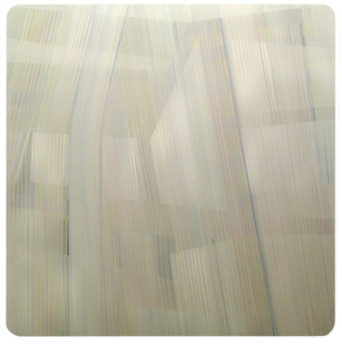
Schellinger's PDX-#9,07,2007 With 10 identically sized, cool-toned stripe paintings, an ice sculpture of the artist's head and a floor filled with black jaw breakers, Bryan Schellinger's New Works at Quality Pictures was the definite standout of First Thursday shows this month. Finally, a main Portland gallery is willing to challenge a show's homogeneity through related, but initially chaos inducing elements. ...elements that in this case inform one's understanding of the paintings. This show is a good thing for the First Thursday crowd, as previously one had to go outside the main Pearl District venues to experience anything that didn't just politely hang on a wall or sit on a floor. 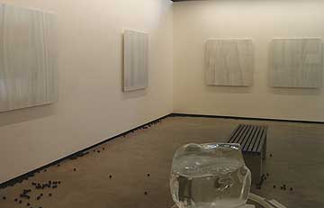 Installation View It is also an exciting debut of an artist whose work has grown considerably since leaving Atlanta for Portland over a year ago. His previous work has consisted of Tim Bavington-esque candy colored stripe paintings and homoerotic edited ultimate fighting video bouts… but somehow this latest show seems to pushing into Matthew Barney-esque myth building by using food and melting ice as well. Still, despite these additional theatrics and associations it is the paintings that speak clearest and longest, which perhaps is what makes the gesture to complicate the opening week with candy and ice worthwhile. Still, some may ask, why complicate nice work? Long Answer: Ever since Barnett Newman, paintings comprised only of stripes have had a reputation for reductive puritanical severity and remove from daily life that isn't entirely deserved. Also, most artists no longer see Greenberg as the big bad aesthetic wolf and a true sense of pluralism has set in now that the polarizing elements of his legacy have aged. Today artists like Daniel Buren, Tim Bavington, Sarah Morris, Linda Besemer, Julie Mehretu, Karin Davie and Jim Lambie have all successfully adapted the simple stripe to become pragmatically responsive to elements like architecture, the perception of space, the body and music. The trick is letting outside elements in to complicate what would otherwise become process driven and formalist art instructions, similar to what Bernard Frize developed in the late 90's. Maybe the 21st century response to this trick to not be too controlling about the end result and let the stripes interract more catholically with other genres? Bryan Schellinger seems to be embarking on a similar pragmatic journey away from Barnett Newman's Onement by complicating his stripe paintings with all sorts of associations, including a false sense of perspective space, allusions to textiles and possibly abstracted veils of drizzling rain? Yet, despite these complications they are essentially process driven formal experimentations. As a painter having it both ways; both purely painterly and complicated through intervening elements...this is the fence to ride these days. 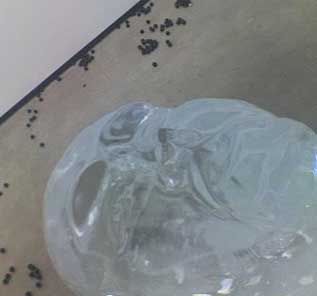
I particularly like the ice sculpture, since including the artist's likeness as a melting form is an antipode to the abstract paintings. Yet through Ozymandian attrition a melting head implies a fading signature, a sense of selflessness or erasure that is apparent in the abstractions here. In other words it mimics the artist's process and intent in a temporal way. Schellinger's paintings all consist of multiple layers of off white stripes that weave and warp. Perceptually this naturally suggests looking through a series of semitransparent veils into some kind of space. Of course it is just an illusion of space. Also like Ad Reinhardt's work it is rewarding to the human eye yet present difficulties when attempting to capture it on camera. This camera unfriendliness is doubly ironic because as a gallery Quality Pictures is known for showing a lot of photography. Since each work is very similar but subtly differentiated Ill pick two to discuss. In a painting like PDX-#9,07, 2007 the weaving lines can suggest one is looking from inside towards an outside populated by massive forms. It seems to have some intriguing earthy tones which depart from the overall glacial colors. Perhaps this is the part of the glacier which has scoured and tilled up the land? 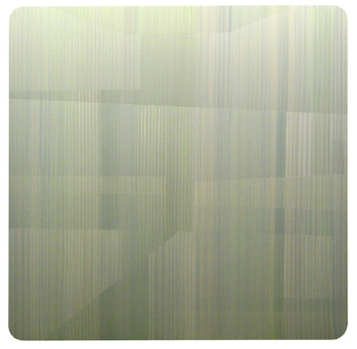 Schellinger's PDX-#1,07,2007 In PDX-#1,07, 2007 the predominantly blue hued tones along horizontal lines suggest looking in on an interior space from behind gauzy curtains. The glacial blue seems purer and cleaner. No wonder aquafresh toothpaste chose this type of color scheme. Kevin Appel uses similar colors but somehow his work seems more institutional, probably because they are more hard edged. The architectonic readings of Schellinger's works reminds me most of Superman's crystalline Fortress of Solitude (from the movies) and in many ways this association fits the contemplative mood of the work. Still despite these similarities, each work is very different and it's a rewarding game of comparative aesthetics to determine which ones I preferred over others. For example I prefer the works that have minor traces of mark making on them like PDX-#9,07, 2007. For me there is something too photographic about the ones with a more perfectly smooth surface, other may prefer the inverse... but to these eyes the mark making creates a disjunctive ambiguity that resolutely declares the objectness of these works. This is emphasized by the jaw breakers which when split open reveal colored strata that resemble the stripes of these paintings. The jaw breakers also imply that it takes time to take in these paintings and its true, the longer one looks at one of these the more ways it can be read. These are paintings that demand visual attention that one would be hard pressed to exhaust with the attrition of time. I've visited this show 3 times already both with and without the candy and ice sculpture and it just keeps getting better. An auspicious debut, Schellinger has show himself to be a force to contend with. Question is how will he expand and complicate this successful series while going beyond the Matthew Barney interventions? Posted by Jeff Jahn on July 10, 2007 at 1:24 | Comments (0) Comments Post a comment Thanks for signing in, . Now you can comment. (sign out)
(If you haven't left a comment here before, you may need to be approved by
the site owner before your comment will appear. Until then, it won't appear
on the entry. Thanks for waiting.)
|
| s p o n s o r s |
 |
 |
 |
|
 |
|
 |
|
|
|
|
|
|
|

|
Site Design: Jennifer Armbrust | • | Site Development: Philippe Blanc & Katherine Bovee | |