|

|
|||
|
Portland art blog + news + exhibition reviews + galleries + contemporary northwest art
|
||||


Catch these sparklers, before they are gone Here is are some worthy things that come down shortly:
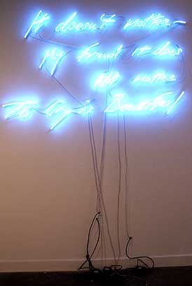 Emin at PNCA At PNCA's current Feldman Gallery show, Habit Forming (reviewed previously here) Tracey Emin's "It Doesn't Matter My Friend, It Does Not Matter (To Cry is Beautiful)" stood out as my favorite thing on view this month. This surprises me as I generally can't stand neon word art that is not by Bruce Nauman, Joseph Kosuth or the late Jason Rhoades (it's just too easy for any hack to use some wry but obliquely evocative words). Long ago, I added Emin to my "real deal" list, but just couldn't admit it publicly. In this case, Emin's work isn't derivative and acts as a kind of open emotional wound… that isn't as vulnerable as it first appears. I want to write her off as a mess but actually she's a bit of an emotional alchemist who creates inoculations against personal vulnerabilities by confessing (and weakening) those sad, embarrassing moments of sincerity in a way that draws the viewer's reaction into the piece. Related to Beuys, it's a kind of oblique emotional shamanism that calls its empathy and public embarrassment into question. By "making a scene" as public art spectacle the tabloid fodder personal content becomes a bit more universal and It's thrilling to see how Emin works with an empathetic/pathetic language that has become so influential with younger artists (though they generally lack her complexity). Emin exploited the bad girl image to frayed but not unintelligent ends, exposing the human obsession with the pressured emotional control of women. She's found a way to have her cake and eat it too, with the artwork as a more concrete and totemic form of public outburst. Her art is partly about surviving her own formidably messy image and this piece does just that. Emin's best works make the sentimental provocative and complicated in its near universal emotional liscense. Is it F'd-up humanism? Maybe it's the kind of humanism we deserve? 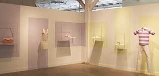 Shapiro's Point of Purchase at PNCA Nearby at PNCA's Isquerdo gallery Nathan Shapiro's Point of Purchase was very well installed and in its best moments complicated shopping, craft and privacy. Though a little too literal the; shirts, dresses, belts and purses made from receipts and credit cards had an expert presentation and execution. Still we have seen this idea before and its only the superior execution that makes it stand out. The two chair pieces had a similar literalness that looked great that also seemed to keep them from really coming alive. 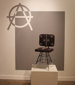 Shapiro's Hot Seat Still, the Hot Seat is the most successful work in the show, a kind of commodified rebel furniture moment. The chairs though related to the clothes didn't seem to belong in the same room either, effecting the show's nearly pulled off coherence. Shapiro is a formidable new artist on the scene but he's still in search of his voice, maybe it is still out there somewhere between rebellion and shopping but that's a cluttered field.  Rice's Apotheosis Seattle's Tivon Rice at the Art Institute of Portland had similar problems. His "Apotheosis" (I'll forgive the bad grad school title since he is a recent MFA grad) was mostly one or two ideas presented very well in a too literal fashion, then repeated over and over again. Without the repetition it would have simply been curious, instead it is ambitiously redundant which ultimately stifles the curiosity factor of his CRT based work. Also, aren't CRT's a little dated already? He's young so there is promise here but artists like James Turrell, Nam June Paik, Yayoi Kusama, Dan Flavin, Mona Hatoum, Erwin Redl, Laura Fritz (my GF but please forgive because it is relevant here), Olafur Eliasson, and Bruce Nauman all do more with less to create fascinating light driven environments. Apotheosis is a flawed but promising introduction piece, the question is whether to go more pop or minimal from here? 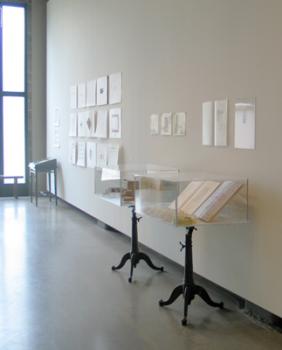 Book Art at NAAU Lastly, the By All Means: Artists' Books and Objects show at the New American Art Union featured a very coherent, museumy installation. Definitely worth a look, this show brought up the question that nearly every book art show raises, "does the typical presentation of books in glass cases overshadow and or render the books as too precious?" I'm not suggesting if you've seen one good book art show you've seen em all, but this show inherits the anonymizing tendency of the genre. 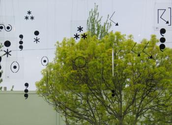 Tetenbaum & Abel's Weather Report at NAAU One piece, "Weather Report" by Barbara Tetenbaum and David Abel, which hangs from the ceiling, gives a semiotic antidote to the problem. I've seen similar presentation approaches by Liam Gillick etc. but I like how their piece incorporates strange punctuation combinations turning the space around it into nonlinear visual text. Words are overrated and this piece drove that point home. Also, make certain to check out the Mississippi:May warehouse show, I'll have a review on that soon. Posted by Jeff Jahn on May 25, 2007 at 12:08 | Comments (0) Comments Post a comment Thanks for signing in, . Now you can comment. (sign out)
(If you haven't left a comment here before, you may need to be approved by
the site owner before your comment will appear. Until then, it won't appear
on the entry. Thanks for waiting.)
|
| s p o n s o r s |
 |
 |
 |
|
 |
|
 |
|
|
|
|
|
|
|

|
Site Design: Jennifer Armbrust | • | Site Development: Philippe Blanc & Katherine Bovee | |