|

|
|||
|
Portland art blog + news + exhibition reviews + galleries + contemporary northwest art
|
||||


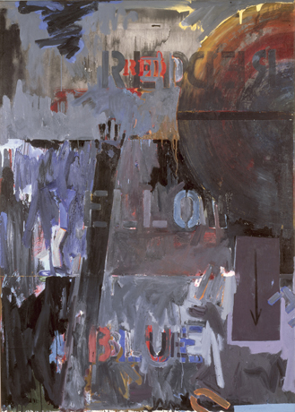
Red Yellow Blue by Arcy Douglass
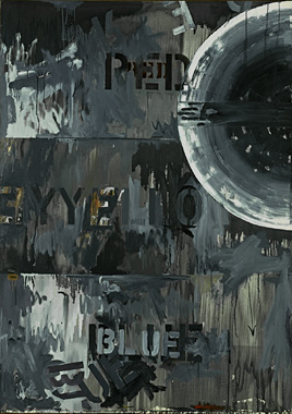
Starting from the three primary colors, an artist can, with the addition of black and white, mix any of the colors within the spectrum. Nothing could be more sure. Nothing could be more stable. All of the colors that could possibly exist from three short words: red, yellow, blue. Within the three sides of the mandala, so like a color wheel, everything can be located, measured and defined. The colors begin to relate to one another as people do in a relationship. Our proximity to our partners allows us to locate ourselves on the color wheel. They provide a stable anchoring point in rough seas or a pole star that allows us to navigate our lives. But what happens when those relationships break down? How do we define ourselves without our opposites? In Jasper Johns' painting the stability of the triad of colors begins to give way. We lose our sense of direction and feel the soft sand of the beach beneath our feet slowly slip away as we are swept out to sea. How did this happen? In a Jasper Johns painting nothing is as it seems, and Land's End is no exception. When Magritte made the famous statement about the painting of the pipe "Ceci n'est pas une pipe." (This is not a pipe.), he was questioning how a painting of an object, in this case a pipe, is similar or not similar to the actual object. In the same vein, Johns' questions in Land's End, and many of his pictures of the `60s, are whether the name of the color is actually the same thing as the actual color itself, and maybe more importantly, how does anyone know or agree that a color like is red is not, for example, actually yellow. Where does red stop and yellow begin? Is red defined by its opposite, for example, that which is not yellow or blue? Is red without some intrinsic quality, but just a description of relationships? Who decides? These are a lot of questions, but this what happens when you think about a Johns painting - a lot of questions and not very many answers. We are beginning to get carried away now as the water swirls around our feet and we see a large wave on the horizon. But maybe that is precisely that point, that there are no answers. There is no stability and we are not sure of anything. Nothing has intrinsic value, only labels and descriptions. The things that we use language to describe are only defined by their relationships to something else and that everything is interconnected. Land's End is made of three stacked rectangles each stenciled "RED", "YELLOW", and "BLUE". In the right-hand corner adjacent to the upper rectangle with red stenciled inside is a half circle with a paint mixing stick(?) attached in the center. From the bottom, a hand reaches upward. On the lower right is a small panel with an arrow pointing down. The word "RED" is stenciled three times, the first in red, the second time larger and in black, and the third time black, red and yellow, reversed and overlapping half circle with the mixing stick. To me, it is as if Johns is asking if "RED" is stenciled in red, does it still mean that same thing if it is stenciled in black, or if it is reversed. The ability of language to describe a visual experience begins to break down and words lose their meaning. The painting creates and reinforces a pattern of recognition and reversal while at the same time undermining the possibility of a complete statement. The mixing stick and the half circle are my favorite parts of the painting. The mixing stick is rotated around a fixed center point pushing the paint around, creating the semicircle. Did the stick actually make the semicircle? Maybe, but you never know because it is only an open association. The stick is retained as sort of an artifact of the process of creation. In later paintings, and perhaps implied in Land's End, the semicircle and the stick will adopt a wide variety of meanings, such as resembling the hands of the clock or the way the arms pivot around a human torso. The mixing stick had also been used in earlier paintings such as Good Time Charlie, in which the stick acts like an arm carrying a cup to the top of the painting. If the abstract expressionists were fueled by alcohol, they never produced a painting as straight forward about the mechanics of drinking as this one. For a painting with stencils of the words of the three primary colors, there is not very much color in this painting, and there is a rarely a one-to-one correlation between the names of the colors and the paint within the rectangles. The painting is mostly gray, but a mix of warm and cools, brown and blue grays, in fact the painting is practically an exploration of the way the gray can interact with colors. Gray is the middle of the spectrum, a mixture of black and white, or the actual color that you get when you mix complementary colors together. If anyone needs an example they can look at Gamblin's Torrit Grey, which is a gray, made up of all the remains of all the other paints that they produce in the paint factory. So in a very subtle way, gray could be full of colors, maybe even the entire spectrum, but not necessarily in an amount that we would be able to distinguish individual colors. Our eyes blur (or average) the particles of pigments together so that they appear gray, but at the microscopic level the particles still have their original color. In Land's End, it is as though every statement that is made is declared, doubted, canceled and maybe reformulated into a new statement so that the process could continue. There is never a resolution, in fact Kirk Varnedoe said "Johns is in love with the conditions of irresolution." Now we are swept away, nothing is as it seems, and we are left floating in an ocean, literally swept off our feet with nowhere stable to stand. Land’s end indeed. It is an interesting parallel that a sibling painting in black and white is called Periscope Hart Crane. Hart Crane is a famous poet that threw himself into the Gulf of Mexico one night from a cruise liner in 1932. In the same year as Land’s End both Periscope and Diver were created. Diver is the masterpiece large charcoal drawing of a person diving/falling/possibly reemerging, with the outstretched hand that is closely associated with Hart Crane's drowning in the water in those last terrifying minutes of his life. The paintings and the drawings become of record Johns' own world being turned upside down, and he identified in Hart Crane's death not only in a man’s frustration at never being able to express himself (or so he thought) but maybe also the despair of never being happy, never finding (or finding and losing) a person that could have acted like an anchor in tumultuous seas. The rectangle in the lower right-hand corner with the arrow pointing down has always been mysterious to me. I wonder if it is a door that is offered to the viewer that contains something valuable but is impossible to open or perhaps the down-pointing arrow is another metaphor for falling. The arrow also implies that it would move perpendicular to the picture plane rather than in the picture plane like the mixing stick. Perhaps it s a precursor or a prototype to the pieces of wood that Johns will use in his Catenary series to both conceal and reveal images one behind the other. At the end of all of the statements and cancellations we are left with a painting of remarkable beauty. Land's End is also an intense look into another person's despair with all of the pain and frustration of bad break ups. Land's End as a painting is less interested in looking for answers, but is more like a consciousness full thoughts and doubts, contradictions and insights. Posted by Arcy Douglass on March 15, 2007 at 18:08 | Comments (0) Comments Post a comment Thanks for signing in, . Now you can comment. (sign out)
(If you haven't left a comment here before, you may need to be approved by
the site owner before your comment will appear. Until then, it won't appear
on the entry. Thanks for waiting.)
|
| s p o n s o r s |
 |
 |
 |
|
 |
|
 |
|
|
|
|
|
|
|

|
Site Design: Jennifer Armbrust | • | Site Development: Philippe Blanc & Katherine Bovee | |