|
An Interview with Marne Lucas
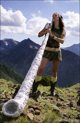
Marne Lucas, MLSP: Alphorny, archival pigment print 2006
Artist Marne Lucas and I took brief respites from our densely packed holiday schedules to sit down for an electronic bi-coastal conversation about her current exhibition, Sitting City: Portland Artist Portraits. The images of local artists created for Sitting City were partially funded by a RACC (Regional Arts and Culture Council) project grant, and represent a small cross-section of Lucas's ongoing project of capturing the appearance and essence of her artistic peers.
Sitting City will be on display at the Mark Woolley Gallery at The Wonder Ballroom (128 N.E. Russell) until December 30th, along with simultaneously running exhibitions of artwork by Arnold Pander and Casey Burns. There will be a closing party on Friday, December 29th from 7-11pm featuring live art by Arnold Pander at 9pm and music by DJ Allon. Lucas and Burns will be present Friday evening as well.
Jessica Bromer: One of the most interesting aspects of your artistic practice as a whole is the fact that your work exists on a spectrum between two types of imagery that are traditionally considered distinct: erotica and "fine" art. What strikes me about the portraits in Sitting City is the way in which some of the visual conventions of pin-up photography can be seen in these images, most of which aren't erotic in a traditional sense. As in a lot of classic erotica, all of your sitters have been given (or chosen) something simple but symbolically charged to pose with or within, whether it's a prop, an environment or a combination of the two. To what degree, and in what ways, did your experience as a pin-up photographer affect your aesthetic or conceptual choices in this project?
Marne Lucas: The many years of pin-up and nude photography absolutely informed the essential relaxed atmosphere needed in making the artist portraits. My interest in portraiture is based in intimacy. Being able to make subjects comfortable while coaxing them to open themselves up to your process is such a gift--taking the picture comes after. The somewhat stagey use of setting, props, wardrobe and art direction is directly related to my pin-up work. I still make nudes and erotica, mostly as an exercise to keep me warmed up as a photographer; and because I love the process of working with new people. I am always pleasantly surprised by the interactions on set, the subjects' views of themselves in the work and the subsequent application of the work. The debate about erotica vs. fine art seems to be lost here in Portland; it seems that if I were making paintings, I might have an easier time of getting the fine art tag! I am rather uninterested in defending why I love to photograph skin, intimacy, mood or the body. It seems completely natural to me to do so.
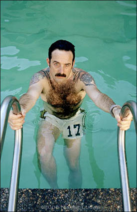
Marne Lucas, Storm Tharp, Pool, archival pigment print, 2006
JB: The poolside pictures of Storm Tharp are evocative of images of the mustachioed male sex symbols of the 1970's while simultaneously transferring some of the iconic poses of feminine glamour--emerging from water and lying around the pool in a bathing suit--onto an individual with a extremely male physical presence. Of all your subjects, Storm is the artist best known for his own experimental self-portraiture. How did that affect the choices you made in creating your own portrait of him? How would you describe the relationship between these images and Storm's artwork?
ML: I have made pin-up images of men and am a huge fan of Bob Mizer and James Bidgood. Their influence is definitely apparent. Beefcake/pin-up art interests me, and my own nature lies somewhere between feminine glamour and gay male beefcake....I myself also make a lot of self-portraiture based work, so I was really curious to work with Storm Tharp. Making and showing self-portrait based work, no matter how abstract or autobiographical the work is, begets a strange reaction from the viewer. The immediate label is 'narcissistic'. OK, so that might be a good technical term, but that can be a reductive assessment. Why get stuck there, viewer? So being aware of Storm's work, his persona, his chameleon-like ability to change his appearance....all of these things I can relate to and feel really aware of and responsible toward representing him accurately. I was a bit intimidated by the process, I am in awe of his work, I did not know him well, and we had about an hour and fifteen minutes to make portraits. Well, in that time I shot five rolls and about seven different looks. Truth be told, I could have made an entire show of just Storm. Stylist Bernadette Spears, Storm and I had great chemistry and could have kept going. I printed three images of him but would have liked to have shown five. I felt a real kinship to Storm during the shoot and when I saw the film, I felt entirely vindicated. I think that what he is exploring within his own work is about a 'feeling.' whatever that feeling is; I do think that my portraits hint at that expression. They represent what he wants us to see in him, at that moment.
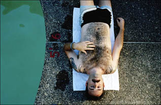
Marne Lucas, Storm Tharp, Poolside, archival pigment print, 2006
JB: I agree that a whole show of Storm Tharp pictures would be totally fascinating. In what ways did stylist Bernadette Spears contribute to this project?
ML: Bernadette and I have been working together on projects for about five years now. She is a freelance stylist and producer for photography and film. I aim to match my crew with the personality of the project. She has tremendous vision, I just tell her what I am after and let her add her own vision. She charms the pants off of the talent! She's worked on many of my pin-up shoots, so she is sensitive to the particulars of those environments, has a similar history of working intimately with talent. She posed for me in 'Oregon's Natural Resources' and was key stylist to that project, so she knows what I want intuitively. I knew that I needed her creativity for Storm, Paul Green, Jeff Jahn and Molly Vidor.
Paul Green's shoot with the decoy deer required shooting fast while getting an intimate feel. The reality was that we were at the edge of Stonehenge, it was the Fall Solstice and a busload of high school-age girls had just arrived. Bernadette has the right personality to work fast on set with a wicked sense of humor that keeps things moving! She gave him the deliberate sleek hair and hint of glossy lips that makes the thousand-yard stare seem romantic.
Jeff Jahn is often seen in public doing his curatorial work, but I wanted him to be playing his guitar and being more introspective and I need a stylist that can work closely and subtly with a subject, oh yeah, and I knew she would want to brush his hair!
Storm Tharp's sense of style is Bernadette's ideal in man, I think she and Storm dress alike. With Molly, I knew that Bernadette could get her into the 'Molly zone' that I wanted for 'Backyard Hollywood'--a totally glamourous yet raw and playful aesthetic. They blasted music and drank whiskey and stayed totally focused on the project. Not every stylist can juggle professionalism, creativity and keeping it a bit wild like that.
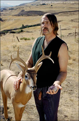
Marne Lucas, Paul Green in His Own Landscape, archival pigment print, 2006
JB: That's so funny--the bus full of teenage girls. Are the images of Paul Green direct visual quotes from his paintings or are they more intuitive evocations of his approach to subject matter? Can you explain a bit about the significance of the deer, amethyst and phallic exposure....or is this symbolism that he and/or you like to keep somewhat veiled in mystery?
ML: The image of Paul with the deer is pretty much derived from a painting that I had seen a few years ago at Lyonsweir Gallery in NYC. It was my favorite painting in the show and there was a nude man with that stare of loss, he was feeding a deer a red faceted jewel. I approached Paul about posing for me as the subject in his own painting, so we had the shoot planned for about five years. I ordered some glass jewels online years ago, but on the day of the shoot I forgot them. Bruce Conkle was also assisting me that day, and he had the idea to borrow a chunk of amethyst from the little gift shop at the edge of Stonehenge. The wardrobe was Paul Green's idea. I love the image because your eye starts with Paul's expression, then goes to the jewel in his hand, then to the deer, where his other hand is resting. You completely bypass the semi-soft cock at first glance. The cock isn't meant to take over the picture, just as there are incidental but essential wonders in Paul's paintings. The other image of Paul in the metallic fire fighter pants is an exercise in making a landscape + figure in the style of Green's paintings. We don't know why the man is kneeling there, but we know that it is macabre and beautiful. Paul's paintings just make sense to me.
JB: In the self-portrait that you included in Sitting City, you show yourself with a sculpture created by another artist, Bruce Conkle. What were you hoping to express about yourself as an artist, or as an individual, through this choice?
ML: Two summers ago I returned to Wallowa Lake for Chief Joseph Days, where I had made the 'Oregon's Natural Resources' portraits. In 'MLSP: Alphorny' I pose with an aluminum foil 'alphorn' which is used as a prop just as all of my other portraits have a prop. The fact that the sculpture is made by another artist poses no specific conflict nor platform for ideals, it's merely a tribute, to my community of artists and the work they make. I've shown other artists' works in the backgrounds of my portraits....I once made a nude photo of a model inside of a sculpture by James Harrison for the ONR series.
For this self-portrait, Bruce Conkle made me a travel version of his alphorn from a previous show, to fit inside my friend's Prius in two pieces. We took a tram 4,000 feet up top the top of Mt. Howard, where I made some photographs of models Adazoe and Kurt Ehrler. I was going through a phase of dressing like I am in the photo: I call it 'Swiss Mess.' Sort of Heidi-meets-Metalhead. The fact that Conkle is half Swiss and had made the alphorn really fit my aesthetic. I am very much a nature girl, but love urban culture. Where nature and culture intersect is what I have been after in my work lately and this self-portrait suits my dual/Libra nature perfectly.
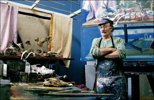
Marne Lucas, Henk Pander, Studio, archival pigment print, 2006
JB: The only artists who are literally portrayed in their own private environments are Trish Grantham and Henk Pander, who are shown at home and in the studio, respectively. The picture of Chandra Bocci posed in a graffitied lot, in a cardboard castle with a cardboard moat, could be interpreted as a wry take on the contradictions involved in showing artwork in museums and galleries--the insertion of an artist's highly personal world into spaces that are highly controlled, but not exactly under the artist's control. Was your decision to pose so many of your subjects in public spaces motivated partially by the fact that a professional artistic career necessitates a public life?
ML: Well, Henk is in his studio, which suits his nature. Being in his studio feels a bit like being a place somewhere between here and in Holland. Trish quips that she never leaves her house, so I thought it would be perfect to shoot her at home in bed and in her studio clothes. She is so prolific, probably because she is staying home and making work!
I have never had a studio, ever, so I developed my work on-location which presents lots of creatively challenging limitations which is what I like about my own work. I don't think I could match my own work in a white studio with cyc walls. Being in public brings an electricity to the situation. When I chose the abandoned highschool for Chandra's shoot, it was a clean slate and somewhat public property. When we arrived, there was a chain link fence around it and it was covered in graffiti. We had to sneak in with all of our gear and the castle! I was initially appalled by the graffiti, then quickly loved it for its texture, its brattiness....it seemed to bring out a new side to Chandra, while I don't view her as insolent. The location and the dramatic opera dress and ratty castle in the rain made for a wistful playground for the imagination. I do like your analogy though, it seems an apt one, that someone as talented as Chandra would have to narrow her focus to become salable in the art market. Taming a wild pony so to speak.
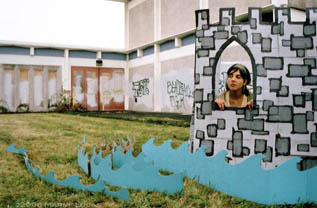
Marne Lucas, Chandra Bocci, Castle, archival pigment print, 2006
JB: I like the tension in the picture of M.K. Guth--her look of mild apprehension seems to indicate that she's worried that at any moment the ice might crack and swallow her up, or that her illusionary world will shatter, revealing the frozen lake to be a mere ice hockey rink. Your artist statement indicates that this image is based on one of her childhood memories. What was it about this particular memory, or its relationship to her artwork, that inspired reenactment?
ML: M.K. and I were chatting at a party once about our families in Minnesota & Wisconsin, how I grew up hunting with my dad and she went ice fishing. I think the mounted fish that she caught, hanging in her house, is what started the conversation. M.K. often appears in her own work, so she is adept at totally being herself while playing a character.
For the shoot she was on the ice on a Sunday morning, so she looks perfectly cold, sleepy, bored and restless all at the same time. She really responded to the unchanged-since-1962 hockey rink, and thought it looked just like places in Wisconsin. She was totally at home in that environment. I think it's a perfect portrait of her, and the idea to have her on the hockey rink with a cartoony ice hole came to me in a flash, and it was complete.
I myself remember freezing cold, rainy 5am Saturdays, sitting in duck blinds with my dad, drinking hot chocolate, flinching every time the shotgun went off, hating every minute of it. Now I remember those times as childhood spiritual experiences with my dad, enjoying the quiet, being near him. He's gone now, so I am left with faint memories. I think there is an element of my own experiences in this portrait of M.K.
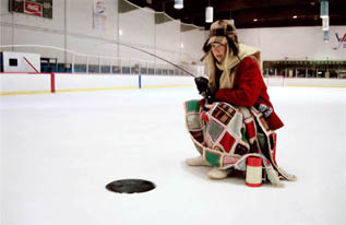
Marne Lucas, M.K. Guth, Ice Fishing, archival pigment print 2006
To view the entire portfolio of photographs from Sitting City: Portland Artist Portraits, as well as images from behind the scenes, visit www.marnelucas.com.
Posted by Jessica Bromer
on December 27, 2006 at 9:11
| Comments (7)
After reading Jessica's excellent interview and Marne's articulate, intelligent answers, I decided to make the trip to the closing party at the Mark Wooley Gallery on Friday night. I did a little snooping online at the linked website to familiarize myself further with the work before I left. The concept and images seemed really interesting, the execution, however, left me questioning some choices.
The online experience of the photographs was much different from the examples in the gallery-which, believe me, I understand. On the whole, the prints at the gallery were grainy and flat; a lot of the subject's faces were in shadow. To my mind, this is in conflict with the general concept of the show. These are cinematic ideas, fantasies. Their approach should be lush, hyper-real and dense. In other words, tight grain and fill light. I stop at the surface of the work because the surface bothers my eye and then I can't move into the work because of technical issues.
Three of the photographs are outstanding because the lighting, subject and color all work together. Molly Vidor, Backyard Hollywood-creepy. M.K. Guth, Ice Fishing-Funny. Storm Tharp, Pool-ga ga ga gorgeous. But, as with the others, the grain is spread and I noticed the surface of the images at the gallery. I don't believe that it is Marne's intention to have us notice the surface of the paper, the grain of the film or the shadows resting over her subject's faces (as in: Paul Green in His Own Landscape/ MLSP, Alphorny/ Bruce Conkle, Redwood Forest/ Tom Cramer, Mirrors/ Bruce Conkle, Caldera/ Brenda Mallory, Sculpture/ Jeff Jahn, Stonehenge Memorial/ Jacob & Arnold Pander, Seattle Public Library/ Paul Green, Kneeling), so I wonder about her technical choices.
Obviously, much care goes into the work. On Marne's website I found out that she uses a stylist and has a crew. From the press release at the gallery it states that she's using a 35mm camera-which I assume means film. Yet, she's printing archival pigment prints, which is a digital process. Why the crossover? Is that why they're flat and grainy? The printer claims they can produce "silky smooth, grain free results"-what happened? What film speed, if it is film, is being used? It looks like 800ASA. Why not employ 50 or 100 or change the settings to a slower speed/larger file if they are in fact digital? What about fill light-I want to see those faces that she wants us to see, to associate names with faces, as is stated in the press release.
I can understand why RACC gave her a grant to do this work. The idea is interesting; her background is exciting. There is a lot to like about this project. The technical concerns create a hiccup though, which keep the work from flying past my inner photo geek.
Posted by: melia at December 31, 2006 08:03 AM
Marne's presentation choices were very deliberate and I think she can better answer them. As for my photo, it was my preference that the focus be on inward concentration and what Im doing rather than yet another photo of my face.
Posted by: Double J at December 31, 2006 11:52 AM
Everyone's choice of presentation is deliberate. I noticed many of the same things as Melia, but dismissed these "issues" because the images weren't so interesting that I wished they weren't harmed by sketchy technique and printing.
Posted by: jerseyjoe at December 31, 2006 01:18 PM
Ill go on the record as liking the powder prints with their granular nature they have the texture of butterfly wings. A lot of photography is just so slick it is distracting... powder prints are more like film grain and the object-like hanging method makes the subjects seem more fragile. I like that. Putting these on floating aluminum would have been wrong and i preferred the real prints to the on-line versions.
Favorite shots were Paul Green, Molly Vidor, MK Guth, Storm Tharp, Tom Cramer and the Bruce Conkle shots. All seemed to ring true of the people photographed. The show is an important document and is kinda controversial for who is in or out.
Posted by: Double J at December 31, 2006 02:52 PM
Of course choices of presentation are deliberate. I'm merely curious about the conceptual reasoning behind them and I was interested enough in the work to ask. The artist is who my question is aimed at and she can answer them better than anyone else. I hope she does.
As far as the show being an important document, who knows? The information on the gallery wall stated that it was an ongoing project, was far from complete and would be continuing. That seems to be a judgement best left for the future.
Posted by: melia at January 1, 2007 03:25 PM
As I recall, the choice was made to go with premier powder digital prints and the object oriented hang in order to avoid the fussy preciousness of the older methods. These powder prints force people to step back to see the whole gestalt.
It also makes sense to me because it is more painterly. Ive seen a lot of this type of printing in other cities and I believe Marne went way out her way to get these printed elsewhere (NYNY), definitely not slacking off.
It was her choice and photographers are a pretty technical lot... so all the attention to this is interesting to me. Ive been trying to figure out how to mount a series of photographs Ive been workng on for 5 years and it really is a maddening process.
Posted by: Double J at January 1, 2007 06:28 PM
When I went to view the show I spoke with the person working at the gallery about her printing choices. They told me that she shot film and then had the film scanned so she could print them digitally. They also told me that she took this route because she wanted the prints floating in the frame and enjoyed the surface and texture of that particular paper. I can understand these choices as I see it all the time and have seen incredible results. With these prints though it appears that something went wrong in the scanning process. When you try to print an image larger than 8x10 with an insufficient scan you get a lot of "digital noise" and some of these prints are severly "noisy" in the highlights......Harvest Hendersons image especially. I enjoyed the images themselves but I could not help but wonder how much more powerful they would be if they were tradtional C-Prints or had they been printed from better scans. Unfortunately, I walked away from the show quite shocked at how poorly everything was printed. The digital age has its advantages but you have to be really careful.
Posted by: chrisb at January 2, 2007 06:10 PM
Post a comment
Thanks for signing in,
. Now you can comment. (sign
out)
(If you haven't left a comment here before, you may need to be approved by
the site owner before your comment will appear. Until then, it won't appear
on the entry. Thanks for waiting.)
|


![[TypeKey Profile Page]](http://www.portlandart.net/nav-commenters.gif)


