Portland art blog + news + exhibition reviews + galleries + contemporary northwest art

recent entries

Early September Links
Labor Day Weekend Picks
Museumy Links
Wendy Given at Vernissage
Mid August Links
Grace Kook-Anderson in Conversation
Portland Art Adventures
Early August Art News
August must see picks
End of July News
Alia Ali's Borderland at Bluesky
Mid Summer Reads

recent comments

Double J
TJ Norris
harperschwartz
jerseyjoe
Double J

categories


Book Review
Calls for Artists
Design Review
Essays
Interviews
News
Openings & Events
Photoblogs
Reviews
Video
Links
About PORT

regular contributors


Tori Abernathy
Amy Bernstein
Katherine Bovee
Emily Cappa
Patrick Collier
Arcy Douglass
Megan Driscoll
Jesse Hayward
Sarah Henderson
Jeff Jahn
Kelly Kutchko
Drew Lenihan
Victor Maldonado
Christopher Moon
Jascha Owens
Alex Rauch
Gary Wiseman

archives


Guest Contributors
Past Contributors
September 2018
August 2018
July 2018
June 2018
May 2018
April 2018
March 2018
February 2018
January 2018
December 2017
November 2017
October 2017
September 2017
August 2017
July 2017
June 2017
May 2017
April 2017
March 2017
February 2017
January 2017
December 2016
November 2016
October 2016
September 2016
August 2016
July 2016
June 2016
May 2016
April 2016
March 2016
February 2016
January 2016
December 2015
November 2015
October 2015
September 2015
August 2015
July 2015
June 2015
May 2015
April 2015
March 2015
February 2015
January 2015
December 2014
November 2014
October 2014
September 2014
August 2014
July 2014
June 2014
May 2014
April 2014
March 2014
February 2014
January 2014
December 2013
November 2013
October 2013
September 2013
August 2013
July 2013
June 2013
May 2013
April 2013
March 2013
February 2013
January 2013
December 2012
November 2012
October 2012
September 2012
August 2012
July 2012
June 2012
May 2012
April 2012
March 2012
February 2012
January 2012
December 2011
November 2011
October 2011
September 2011
August 2011
July 2011
June 2011
May 2011
April 2011
March 2011
February 2011
January 2011
December 2010
November 2010
October 2010
September 2010
August 2010
July 2010
June 2010
May 2010
April 2010
March 2010
February 2010
January 2010
December 2009
November 2009
October 2009
September 2009
August 2009
July 2009
June 2009
May 2009
April 2009
March 2009
February 2009
January 2009
December 2008
November 2008
October 2008
September 2008
August 2008
July 2008
June 2008
May 2008
April 2008
March 2008
February 2008
January 2008
December 2007
November 2007
October 2007
September 2007
August 2007
July 2007
June 2007
May 2007
April 2007
March 2007
February 2007
January 2007
December 2006
November 2006
October 2006
September 2006
August 2006
July 2006
June 2006
May 2006
April 2006
March 2006
February 2006
January 2006
December 2005
November 2005
October 2005
September 2005
August 2005
July 2005
June 2005

contact us


Contact us

search


syndicate


Atom
RSS

powered by


Movable Type 3.16

This site is licensed under a


Creative Commons License

Tuesday 11.07.06

« Election day thoughts on drawing in the aughts | Main | Name the aerial tram cars? »

Ty Ennis at NAAU

picasonew.jpg
Ty Ennis, Hooray Picasso, 2006
courtesy of New American Art Union

Ty Ennis referenced artists Marcel Dzama and Chris Johanson in his last solo exhibition at NAAU, obliquely promising to move beyond their influence in his next body of work. The invention of a completely new style within a year's time is a daunting task for any artist; it's something that only Picasso seems to have gracefully accomplished. Perhaps this is why the man who "never got called an asshole--not in New York" is saluted, with bitter cheer, in the essentially style-less Hooray Picasso.

Hooray Picasso is one of several drawings in The Bronze Loss that, in spite of its placement on luxurious deckle-edged paper, appears to have been torn out of a sketchbook. In that context, Hooray Picasso would be charming, but, placed on a professional gallery wall, it seems out of its depth.

There are certainly artistic gestures that are more potent for their simplicity. Hooray Picasso brings to mind Rauschenberg's iconic Erased de Kooning Drawing, which is just that; it's also a succinct and funny take on the Oedipal impulse of the would-be famous artist and the accepted values of the 1950's art world, in which the macho gesturalism of the Abstract Expressionists was perceived as the limning of a mysterious, heroic spirituality. De Kooning, who was a good sport and perhaps the most laid-back of the Ab-Ex titans, contributed a drawing for this experiment willingly (albeit one that he knew would be particularly difficult to erase).

With their fields of empty ground, Ty Ennis's drawings suggest erasure whether or not the telltale scuff marks are visible. His most pronounced formal achievements are a powerful dexterity with the nuances of line weight and a disciplined commitment to obsessive, microscopic detail. This capacity for myopia is a double-edged sword, however; this body of work leaves no doubt that it was created by a young man.

Female figures, when they appear, are faceless. In two works, women are seen from behind and seem so placed in order to reinforce the brooding sexuality of the drawings' male subjects. In a third, How we sat all night saying nothing and laughed in the morning...a woman covers her face while a young man stares out at the viewer with steely defiance. The most fully realized female figure, also seen from behind, occupies After we died, you were quick to haunt. This is one of the most affecting drawings in The Bronze Loss. The obsessive detail lavished on the woman's back evokes the strain of under-requited love with a believable pathos that many of Ennis's other works strive toward unsuccessfully, and the blunt but richly evocative title is the best in the show.

Text is clearly important to Ennis. In one drawing, he playfully positions himself as J.D. Salinger and offers us Nine Stories. The titles are letterpressed, an archaic, painstaking process that seems perfectly suited to Ennis's work, in which the spare mark-making is evocative of lettering, titles are integral, and the images seem to have been seared into the paper like tattoos on skin. The most captivating of Ennis's stories is "Fucking Up and Down the Stairs." The F-word has lost its power to shock. But fucking up and down stairs? Its a surprising idea, and funny--like "Love in an Elevator" but so much more awkward. Some of the titles appear to be riffs on Salinger's titling style, and these are funny too, in a more low-key way. Ennis's use of ink to "stain" the book so that it looks like a relic of the 50's--an original edition--and the dry nod to modernism of the colorblocked design, are both effective ways of translating his work's self-conscious style into formal terms. A plea forever to never die similarly incorporates text and trompe l'oeil. Lines of colored ink are strung across heavy drawing paper in an impetuous reference to the notebooks that the newest legion of drawers has been criticized for overusing. This is amusing, but the wit of the gesture is undermined by the maudlin-cute text.

Houseful of Emptiness.jpg
Houseful of Emptiness, 2006

Another of the exhibition's most successful works, Houseful of Emptiness, is compelling because Ennis's use of the vast white space to signal the subject's isolation is integral, not cursory. This spacial sophistication was perceptible in his first solo show at NAAU, but seems, mysteriously, to have largely disappeared. Bedsheet escape routes coming out all of the house's orifices evoke tears and blood, and there's a compelling bit of dark comedy to the fact that everyone seems to have escaped, alone, at once. The unnecessary title is a ham-fisted reiteration of the mood already skillfully communicated through imagery alone. And cast into a well hidden well within my mind also reimagines the white of the paper as an isolating mist. This drawing has a beautiful, meditative quality from which its awkward composition detracts.

Many of the drawings in The Bronze Loss have beautiful passages, but almost all of the work looks haphazardly composed. The majority of the figures are drowning in expansive white grounds, a problem compounded by the drawings' large white mattes. Additionally, The Bronze Loss is less cohesive than Ennis's last solo show, which was itself less cohesive than his first solo show.

New American Art Union is a venue that manages to seem simultaneously professional and homey, and The Bronze Loss is impeccably lit and laid out--all the invisible details that support an exhibition are well-managed. My only criticism of the gallery has to do with curation. Several of the works could have been edited out to make a stronger show. The two almost identical drawings of a free-floating dog head (Ancestor and Ancestor in blood red, both 2006) are the most egregious examples of sketchbook randomness, and the inclusion of both seems to undermine the pretext for valuing each of Ennis's drawings at a high price: the idea that each work is a unique distillation that signifies much more than a casual, easily imitable study.

While some of Ennis's drawings are fully formed works of art, too many seem based on the assumption that the artist has attained the status famously conferred upon Picasso--that of being able to pay a large restaurant tab with a cursory napkin doodle. Picasso attained that power after becoming an awe-inspiring draftsman in his early teens, then relentlessly pushing the envelope of modern art for half a century. Every artist is derivative--his contemporaries learned the hard way to cover up their canvases when Picasso visited them--but the best synthesize their sources to create a highly innovative new cocktail. The Bronze Loss is a complex, sincere portrait of the artist as a young man, which is fascinating--up to a point. To initiate a more deeply engaging conversation between artist and audience, Ennis needs to broaden his horizons.


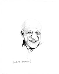
Posted by Jessica Bromer on November 07, 2006 at 12:42 | Comments (10)


Comments

Oh, peeshaw.

Sure, Ennis is on par with the herein mentioned Dzama (an easy reference point that's been made before), though the tongues speak in the topical (Dzama) and the existential (Ennis). Can't we look outside of this form of repeated reference? I mean, if you actually look close, yes, look (and I'm not pointing specifically at the writer of this review as she's formally and liguistically shown a critically hewn eye) - you may see similar lines in greats like Dürer and Degas. Take that breathy gander and you may start to see fanciful lines that are a bit deeper and sharper than a quick pass may collect. Personally, I felt 'The Bronze Loss' was a dynamic and intimate exhibition that doesn't try to grow the artist outside of his already lithe skin. Yes, he's young, the work is still somewhat young, it's fresh - and that's most likely why it is so intriguing. And that has nothing to do with age. Though it comes from dedication, the committment to the process, the studio ethic that Ennis has developed. His satire is wry and autobiographical. Of course it is, the man is still reasonably under 30 for goodness sake. He's significantly started to cut his teeth though, and kept the tone rather ambiguous through illustration and illusion.

I love the way he doesn't merely blow smoke up our ass, instead, he tells tales of loss with a sensitive whisper as seen in the genuinely psychedelic/schizophrenic 'Georgie'. It's like 2 parts tie-dye, very 70s, and mix in the pixie dust of Storm Tharp and voila! It's possibly walking us through stages of a single man's life? It's melancholy is unnerving. In much the same way the barren forest in 'And cast into a well hidden well within my mind' bellows into the psyche followed by an echo of remorse. The beer cans and doggie heads are strongly drawn studies of a starry-eyed artist looking at his own personal still lives perhaps - purposefully pathetic and immediate. These drawings speak of the spaces artists - not always the just-so bright four walls of the art gallery or museum - but to the contrary, in the dusty and dank studio hovels that we rent in hopes of encouraging collectors and others. They speak of real physical space. What clouds our vision are often the simple things.

Every mark in 'Four Wishes' seems to be a breath, drawing life in real time. Ennis has distilled a handful of cattails with basic reference and lots of the void, empty white space which only gives them a a bed to lilt upon poetically. The whole show has this wafting haiku, yet punctuated and strict like a musical composition. 'After we died, you were quick to haunt' is a curious piece that expertly floats a back end view of a female figure donning a 3/4 length sweater sweater, the kind you might buy at Goodwill. What makes it curious is, of course, the title. I'm STILL thinking about what it "says". Knowing the self-referential process Ennis undergoes, possibly she is a relative, or someone close to him with whom he shared a certain loss. Any way you slice it, her faceless half-turned gaze shapes an eerily shiny mane of rich black hair that organically undulates over the distinctive stripes of the sweater. And his tentative use of color references hand-colored silver gelatin prints, with just a hint of sepia.

Over and above this is pretty much the best game in town at the moment.

Posted by: TJ Norris [TypeKey Profile Page] at November 7, 2006 06:09 PM

Not to cheeze you Teej,

I havn't seen this show yet so I can't weigh in on the show specifically but Ive never been much of a fan, but sometimes there are flashes in Ty's work I wouldn't deny. Locally, I like Carson Ellis and Joe Biel (http://www.gregkucera.com/biel.htm a former portlander) better. Both have always felt like they have more developed philosophies. Also, if the drawing is self conscious... then Dzama is a relevant talking point.

Oh and I think Dzama is pretty existential... even compared with Sam Durant.

Also, I think if we are reaching back before the 20th century Goya is possibly the father of all of these artists... and he still holds the title of course. Only Egon Schiele is in a position to challenge him.

Luckilly, it's art and it isn't so much a competition as it is competitive.

Posted by: Double J [TypeKey Profile Page] at November 7, 2006 06:42 PM

Hold the cheese, please. :)

Posted by: TJ Norris [TypeKey Profile Page] at November 7, 2006 08:31 PM

PS: I own works by both Ennis and Biel and find them evenly exchangable after 100s of viewings. Saw a show of Dzama's up at Kucera's joint earlier this year and must say I have limited interest in the daunting coyness therein.

Posted by: TJ Norris [TypeKey Profile Page] at November 7, 2006 08:34 PM

I liked Dzama 6 years ago, and still like his better work. Biel has a laser-like maturity even when adolescent, which is why he's getting some bigger-time national attention. Ennis has grown judging from the work I saw at your show, cant wait to check this out at NAAU.

Overall I dont really see this as a referendum on "art on paper", although I do sense that schadenfreude as a philosphical base for self conscious dawings has really been wearing thin on art vewers.

Posted by: Double J [TypeKey Profile Page] at November 8, 2006 09:20 AM

Ok, now Ive seen the show. Technically Ennis has matured but the philosphical underpinnings are often way too immature to for me to stand. Carson Ellis, Joe Biel and Storm Tharp are much farther along.

Actually, Storm was in the gallery too and I gave him another round of good natured "I expect you to kick ass for your next show" expectations. We discussed the peculiarities of pressure to evolve and expand before a show and how that process gets judged once a show is up.

In growth terms Ennis' show is a big step up from the previous one, he's just got a lot of room to grow from here. There are a 2-4 really nice ones in here though.

Posted by: Double J [TypeKey Profile Page] at November 9, 2006 01:36 PM

My response to Ennis' work since the first time I saw it at Disjecta years ago, is a simple no. His subjects strike me as false, maudlin, and cliched. The most unappealing part and the part that destroys whatever might have been in the work is quickly noticing that his drawings are simply set-ups for the punchline that can be found in the title.

Can anybody tell me what the punchline for Warhol's Soup Can is? How about Koon's Equilibrium Tank? Robert Longo's Men in Cities? Tracey Emin's Bed? Or any single Dzama drawing?

Posted by: jerseyjoe [TypeKey Profile Page] at November 11, 2006 12:06 PM

Aligning Ty Ennis' work with that of Durer seems absurd. The draughtsmanship in Ennis' work has a long way to go to even approach Durer's achievements. Calling it "fresh" may have worked 10 years ago, but now the work seems to be extending stale, trite trends in drawing. As for the review, I found it to be very evenhanded and thoughtful.

Posted by: harperschwartz [TypeKey Profile Page] at November 11, 2006 12:37 PM

"Absurd" is an "interesting" word.

Posted by: TJ Norris [TypeKey Profile Page] at November 11, 2006 01:48 PM

The punchline issue is really perceptive... it reminds me of poetry slams where the poet who does best is usually the funniest one.

Also it looks like the trial of Ty Ennis is underway. Many felt he was too green for the Biennial?... I'm not one of them but I believe he has a ways to go.

Posted by: Double J [TypeKey Profile Page] at November 11, 2006 03:21 PM

Post a comment

Thanks for signing in, . Now you can comment. (sign out)

(If you haven't left a comment here before, you may need to be approved by the site owner before your comment will appear. Until then, it won't appear on the entry. Thanks for waiting.)


Remember me?


s p o n s o r s
Site Design: Jennifer Armbrust   •   Site Development: Philippe Blanc & Katherine Bovee