|

|
|||
|
Portland art blog + news + exhibition reviews + galleries + contemporary northwest art
|
||||


Doing A Lot Of Justice: Thom Mayne's Wayne L. Morse Courthouse in Eugene 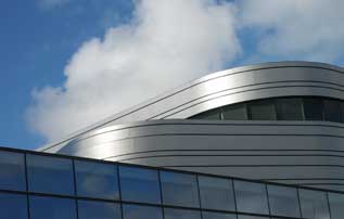
The new Wayne L. Morse Federal Courthouse, designed by Thom Mayne, is without a doubt the hottest new building in Oregon and yes it's in Eugene, not Portland (insert envy here). It opens to the public on December 1st. Still, the mind swims with two curious incongruities: 1) Huh, a hot new courthouse… is that possible? 2) Pritzker Prize winning bad boy architect Thom Mayne… in Eugene? 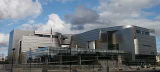
Yes, Mayne is an architect of visual disruptions (love those) while retaining functionality and this courthouse accomplishes that in spades. Still a federal courthouse commission virtually guarantees that the end result would be a child of negotiated compromises, so it's no wonder the building comes off as more stately than Mayne's more rake-ishly angular projects like the Hypo Alpe-Adria Center in Klagenfurt, Austria. 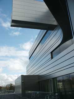
It takes a very good architect to create something fresh under such moderated circumstances and visually the Wayne L. Morse courthouse works. On the exterior metal ribbons peel off the outside like a sci-fi fruit being peeled. On the inside the soaring atrium space is both impressively tall, yet cozy and reminds me of the hearth in Frank Lloyd Wright's wingspread house. The exterior is curved and metal so some will think Frank Gehry, but Mayne's work here is less clustered, rythmic or fugal in its forms. 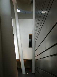 atrium space The exterior ribbon design implies flow, process and continuity without being closed off. The disruptions come from peeling ribbons, as if the courthouse isn't completely dressed yet. It's probably the funnest thing to happen to the court system since we stopped putting our judges in wigs. 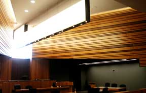 Courtroom To carry the design through to the core the courtrooms unfold like ribbon s of slatted wood, not unlike Alvar Aalto's Wolfsburg altar. Once again, persistence and process is emphasized rather than eagles and columns which are more allegorical symbols than undulating unbroken lines etc. Still much of the interior is calm rather than disruptive and surprisingly this is where the building sings. How's that? …through the improbably well executed use of public art commissions. The four artists Matthew Ritchie, Kris Timken, Cris Bruch and the nationally rising Portlander, Sean Healy. Somehow the Fed's managed to collect and place art in the building in a way that preserves the dignity of the space while livening it up. Once again this is a highly mediated kind of commission so the fact that most of these artists succeed here is a kind of miracle. 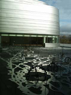
Matthew Ritchie's Stare Decisis The lead artist Matthew Ritchie (an expat Brit) completed an undulating sculpture, Stare Decisis (stand by that which is decided)... an abstracted version of the nearby Willamette river system. Here the undulating ribbons of the building's exterior hearken back the metaphorical landscape in the sculpture and vice versa. The sculpture presents law as a river, not earth shattering conceptually but it looks real good. 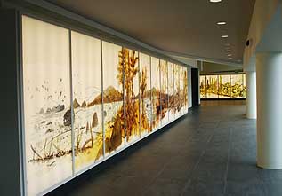 lenticular images shift as one walks by Normally Ritchie overwhelms the senses with information and this seems much more gentlemanly, which isn't bad... it shows his supple aesthetic chops but the three massive lenticular light boxes titled, Life, Liberty and Pursuit seem very toned down. Still they reinforce the river as law theme and the subtle lenticular shifts make walking through the building a calming experience. If this were anything but a courthouse I'd say missed opportunity. In this case it's an exercise in self-restraint that Ritchie pulls off. 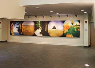 Kris Timken's Witness By contrast one time Portlander Kristin Timken's work seemed to be completely at home in her ouvre. Her pinhole photographs of flora and landscape illuminate and enliven what otherwise could have been a dull cave space in the bowels of the building. Look, if there was ever a place where "flower power" mattered it's Eugene Oregon. The delicate subject matter does disrupt the more brutal mass and angles of the architecture. This work was a big hit with the staff. Cris Bruch's work was still under wraps when I toured the facilities but frankly it just looked like obligatory large metal sculpture in front of the building, nice but unremarkable next to the weirdness of a courthouse that doesn't look completely dressed. I'm a big fan of his tornado/kudu horn sculptures that I've seen in Portland and Seattle though. 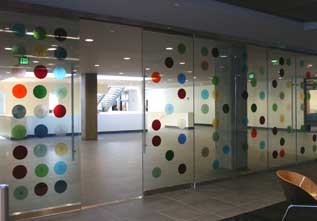 Sean Healy's Jury Pool Lastly there is Portland's Sean Healy who has a lot of big public projects as well as a museum show in 2007 at the CAMH in Houston. Yes, Jury Pool is another highly mediated art piece but it succeeds by polka dotting the massive glass doors that jurors assemble behind. 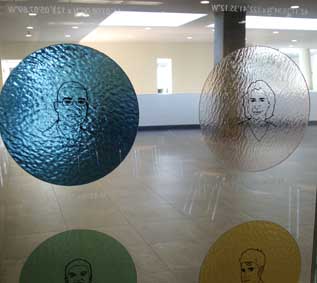 To produce the doors Healy interviewed 108 random individuals asking them their favorite color and favorite place in Oregon. The resulting subjective decisions were translated into GPS coordinates and comprise a kaleidoscope of colored discs with faces that link to places throughout the state. Interesting how Healy chose to use subjectivity to present a prism of the possible jury pool. It's simple and works on both an abstract and personal level as each colored disk contains a face that seems familiar yet filled with strangers. As a measure of its success it seems to provoke the most questions. Some even want the map of Oregon to spoon feed them more information about the people pictured, instead it asks them to map the coordinates above each image to the map. Ohhh how dare public art make the public work and think! Once again, this is not conceptually earth shattering but it should hold up as long as people like polka dots, human faces, favorite colors and places. It's the emergent community gathered in the work (tied to the space of the courthouse) that hearkens back to the jury selection process and it succeeds in doing so without being too literal. If you just want to look at it as an abstraction of dots it works that way too. 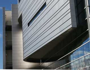
Overall the integration of the artwork into the building is highly successful, even compared to Rem Koolhaas' recent Seattle Library. The work inhabits the building, and the 76 million dollar budget in Thom Mayne's hands seems to do everyone; the city, artists, casual viewers, judges and even the architect a lot of justice. Read more in The Oregonian Posted by Jeff Jahn on November 27, 2006 at 22:59 | Comments (2) Comments How is it possible that Eugene gets such an amazingly modern building, but we can't even get a sleek Apple store on 23rd because it will disrupt the "historical" neighbrhood. Posted by: Calvin Carl I think the new $150 million dollar Multnomah country courthouse project that looms in the future is a great opportunity for a design comission... and it should have an art exhibition space built into it like the Portland building has, only a bit larger and less marginalized design-wise. The tram is our new thing and hopefully it sparks many more interesting designs in the city. Posted by: Double J Post a comment Thanks for signing in, . Now you can comment. (sign out)
(If you haven't left a comment here before, you may need to be approved by
the site owner before your comment will appear. Until then, it won't appear
on the entry. Thanks for waiting.)
|
![[TypeKey Profile Page]](http://www.portlandart.net/nav-commenters.gif)
| s p o n s o r s |
 |
 |
 |
|
 |
|
 |
|
|
|
|
|
|
|

|
Site Design: Jennifer Armbrust | • | Site Development: Philippe Blanc & Katherine Bovee | |