|

|
|||
|
Portland art blog + news + exhibition reviews + galleries + contemporary northwest art
|
||||


Alice Wheeler and Jesse Hayward at Chambers 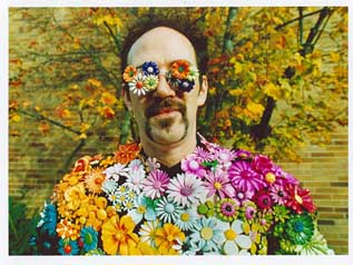 Alice Wheeler's "Man with Metal Flowers" 2006 Two conjoined shows ponder the effects of color, complexity and the charm of clarity this month at Chambers Gallery. Although unaware of one another up until this point the two artists couldn't have been better paired. Both are acquaintances of mine to varying degrees and I just couldnt ignore this confluence of decadent aesthetes. Wheeler is a fully developed monster and a great litmus test and foil for the younger Hayward. Alice Wheeler is one of Seattle's treasures. She's represented by the venerable Greg Kucera Gallery, been published in Time and Spin and I even first came upon her work at my favorite Seattle museum, The Henry early last year. Although I normally am ambivalent about celebrity shots, Wheeler's Kurt Cobain prints at The Henry had enough layers to keep me looking for 10 minutes or more. I've been anxious to see more since then... At the Chambers show titled "The Influence of Flowers on a Melancholy Day" I came across a collection of heavily saturated analog prints that mix the melancholy of dreams, gender, identification and place in a way that I always see in Seattle but rarely see celebrated so well in photography. The work's tone reminds me of place somewhere between Camus, Paul Bowles, a Led Zeppelin tour journal and what remains of the spirit of Berlin during Weimar era as filtered through in 21st century America. She is a bit of a subculture specialist but brings a rare and fragile dignity in all of her printed shots. Overall, the subculture angle seems pretty PG in this show and I wish it had more teeth on view. At first the rather unique feel of the different subjects makes the show a little hard to take in as a whole and its best to pick one as an entry. 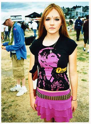 Girl With Bowie Shirt (2006) For me it was "Girl With Bowie Shirt." The subject is young and wearing that color of neon pink that often says rebellion looking for something, anything to rebel against. It's a loud but vulnerable color and her slightly squinting eyes confirm her defensive posture. She's seems aware of the possibility that this photo will be widely seen and wants to avoid revealing too much. That kind of reflexivity is telling. Bowie girl isn't comfortable, her arms are tight at her side and her mouth is in a slight frown, probably from not breathing as the camera clicked away. With a bindi on her forehead and hot pink skirt she's definitely girly but the identification with Bowie and trying hard to be tough belt say she'd rather not be discussed that way. Bowie as a more difficult to classify gender is portrayed confidently on the t-shirt while she seems pensive and easier to sort as someone who hasn't figured out what she wants out of life. She's also clearly out on some recreational outing or concert pilgrimage so this photo reminded me of a character from the Canterbury tales, casting Bowie as a type of the Bishop of Canterbury or the Madonna in this protonarrative about identification. Instead of looking tough though it seems like she's on the precipice of a lot of tough choices, and her gaze tells us its none of our business. I respect that and it is Wheelers ability to create engaging images like this that sets her work apart. Other works like "Boy With a Wolf Hat" are similarly infatuated with the fan's object of identification and is less layered and satisfying. In this scene it's just a boy enjoying the simple pleasures of red licorice in a fan's Washington Huskies hat. The message seems to be finding your bliss amidst the existential swamp to the daily grind. Other prints here do it better. Another great image is "Man with Metal Flowers." I like the fact that the flowers are of a more durable material than real flowers, a kind of armor. It seems to be a metaphor for the reason art objects are still interesting because they are a little more durable towards the effects of time. It is just a great image and its overall saturation level (these are analog not digital prints) unifies the scene with a pregnantly tinted gestalt. Something about the enhanced analog color can create an enhanced empathetic conduit between the viewer and the image. It certainly does so for me but it's more than color, something about Alice only puts people 2/3rds at ease and having the defenses up makes her subjects better. 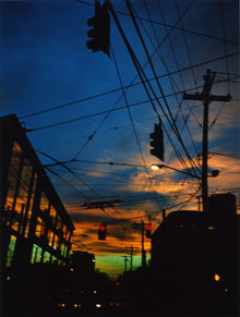 Wheeler's "Jefferson Street At Broadway" (2006) Some prints are devoid of personages though and although I've liked some of her images of houses none of them are in this show. The best of the non-peopled works here, "Red Wall on Rainier Avenue" is nice but it seems to lack the charge her human subjects have in this show. Why is that? What is it about saturated color, psychological layers and people that make "Man with Metal Flowers" so much more than a wall? Maybe it's a question of subtlety? The colors take a rather subtle wall and turn it into a neon sign whereas the saturation gives human's an existential charge that heightens their frailty when transferred to film? The wall doesn't become more frail, it becomes more imposing, trying to compete with reality. The effect doesn't sing to me as clearly, still there is something about a sunset seen through telephone poles and wires like her "Jefferson Street at Broadway." Because of the layout of the show Wheeler's photographs each look like a window, no one print dwarfs another in size and for that reason the show as a whole seems withdrawn. One much larger print could have tied the whole shebang together more effectively. Still, there are some incredibly moving images here.  Hayward's "Both Plus One Too" (L) and "A Particular Circumstance" (R) Jesse Hayward has the opposite problem, he is an intelligent extravert's extravert. His show "Window Box Collective" is very even, which is a complete contrast to his biennial work which is a study in unstable paint lust. Also, he's the only controversial artist in the otherwise well behaved Oregon Biennial. Mostly he's controversial for painting outside the lines of format and has been offending some people's delicate sense that art has to be horribly precious (a Northwest bugaboo that is less prevalent in Portland than in Seattle and Vancouver). Ike covered Hayward's biennial piece thoroughly here but his work at Chambers should confuse the easily confused a bit less. Is that a good thing? At Chambers works like "Rocking Adds Comfort" are homages to stability, albeit delightful off kilter stability. The interlocking picture frames are decked out in mostly pastel party colors calling Mondrian's great Broadway Boogie Woogie to mind. But the real influence is Paul Klee, whose very baroque compositions of colored squares and rectangles seemed to dance together in systems that allowed for some individual variation of rhythm. Rhythmically they lack Klee's fineness but do have some of their indefatigable charm with some Mission District outsider feel. The overall effect is delightful and hardly chaotic and though I'm really drawn to the order of "Both Plus One Too" (clearly about becoming a parent) one feels this is show yet another sampler of what Hayward can do rather than a statement of what he wants to say. 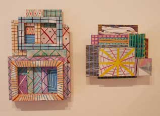 "Not On That Side" (L) and "This Most Dreadful Note" (R) Hayward is an artist of structures and formats, chaotic systems and delight. Yet, one gets the sense this artist is still too compartmentalized and reactionary in his work. Yes it's good and come a long way from his occasionally too assembly line-ish supergoop paintings (some were brilliant too) but the conceptual base seems too arid for such a mad scientist. He seems to be commenting on both home life and the museum world in this show and the Oregon Biennial respectively and somewhere the walls need to come down so the borders aren't so distinguishable. I'd lke to see a rematch of this show in a much larger room with full spectrum of both artist's abilities... it would be scary. This was good but a little too well behaved. Posted by Jeff Jahn on September 13, 2006 at 0:00 | Comments (0) Comments Post a comment Thanks for signing in, . Now you can comment. (sign out)
(If you haven't left a comment here before, you may need to be approved by
the site owner before your comment will appear. Until then, it won't appear
on the entry. Thanks for waiting.)
|
| s p o n s o r s |
 |
 |
 |
|
 |
|
 |
|
|
|
|
|
|
|

|
Site Design: Jennifer Armbrust | • | Site Development: Philippe Blanc & Katherine Bovee | |