|

|
|||
|
Portland art blog + news + exhibition reviews + galleries + contemporary northwest art
|
||||


Malia Jensen at Elizabeth Leach Part 2 Monet's haystack paintings represent a point in his oeuvre where I generally lose interest. The subject matter and the paintings produced seem dull and insipid to me, while at the same time neatly packaging the entire project of impressionism in a summary statement. I'm much more interested in Monet when he operates at the outer edges of the project of impressionism (which really, was his project, Renoir and the others were not at all impressionists). In the outer territory of Monet's impressionism the subject matter is too complicated to easily sublimate into luminous color fields and hazy atmospheres.
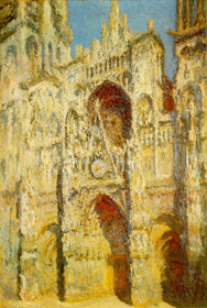
In the Rouen Cathedral series, Monet has to work at disassembling the form into light and color. The forms of the cathedral are so powerful and intricate that they seems to resist Monet's efforts at desubstantiation. In the Rouen Cathedral series, the project of impressionism becomes delicate and full of tension. Some of the paintings acknowledge the complex forms of the cathedral clearly and vividly, while others in the series completely disintegrate into light as a tangible field. Masterpieces of this series are the pictures executed at dawn and after night has fallen. 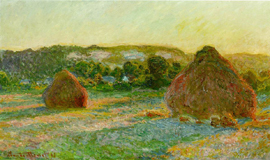
But Monet's haystacks have always seemed a little lame to me, and an oversimplified proof of the unfortunate credo of impressionism derived from one of Monet's casual remarks, something like: "forget what it is you see before you, think only, 'here is a little rectangle of yellow' or 'here a streak of red.' " This credo functions perfectly as a thesis for the haystack paintings, but there is simply no tension, no energy between the formal transformation suggested by the credo and the subject of the painting. A haystack is such an identity-less object: an uncomplicated, non-thing. It's almost better as a painted form, subjecting it to the transformation of the impressionist credo really doesn't take it very far. It is almost a little pile of pure color already. In addition, it is such an innocuous subject as to always make it into the calendars and coffee mugs of culture at large. For all the intensity of kitsch interest in Monet I am certain there will never be a coffee mug or calendar that includes his portrait of his wife on her deathbed. It is among the finest of his works, a shocking outlet of mortal terror and grief which would only find its equal in the latter half of the 20th century in the work of Francis Bacon. Incidentally, this painting seems to utterly destroy the detachment implicit in the impressionist credo. It is clear that the artist is not "forgetting what he sees before him." 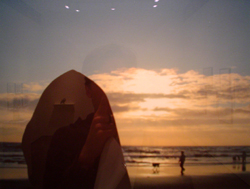
Malia Jensen's Haystack series appropriates, dissects and reconstructs Monet's dull paintings. Her photographs trick and antagonize with an agile sense of mischief. The photographs represent a single, immediate act, that of clicking the shutter. No thought is given to formal principles of composition, no attempt is made to make the subject more interesting. It is the immediacy of Jensen's photographs which resonate with the simplistic impressionist credo. Do not think what is before you, simply apprehend it. This is exactly what Jensen is doing in this series. The difficulty here is that with a camera, Monet's credo becomes ludicrous, redundant to the function of the image-making device itself. Indeed, impressionism is often thought of as a method of paralleling photography in painting. 
Next is the question of the subject. Before the banal seaside landscapes, nearly identically composed in each frame is the dark silhouetted "haystack." We soon realize that this object is entirely unrelated to a haystack. It does in fact appear to be someone's head entirely in shadow, wearing a hoodie. Where Monet easily transformed a shapeless mound into a painted form, clearly illustrating a simple principle, Jensen gives us complexity and obfuscation. It is the language itself used in the title of the series which generates the transformation, and this transformation is awkward and uneasy. Not for one second do we believe we are looking at a haystack. We are instead looking at a complex intelligence disguised as a simple form. We are lulled into boredom by the photographs, and boredom is the perfect environment for the operations of saboteurs. We are looking at a poor emulation of Monet, a weak simulacrum of fine art. In constructing an illusion that is not very convincing, Jensen exposes the delicacy and thinness of the practice of art-making. It is the same delicacy and thinness of Monet's haystacks. They are too easy, too immediate, there's nothing risked, and nothing gained. But sometimes, we want art to be like this. We can't face the terror and vastness of Monet's dying wife. It is liberating to think that art could be the materialization of a single second, of a single thought or impulse. It's like making a joke at a party where you don't know anyone, you have the impulse to say this absurd thing, and it's liberating to just blurt it out, and not worry about the response. Ultimately, this series is a work of complex obfuscation combined with immediate impulse. The possibility exists that the artist intended no reference at all to impressionism, although I believe it to be a succinct joke on the subject. It seems to deny art as a communicative medium, it instead dwells on the impossibility of communication. The figure in each photograph has been made invisible, mute, and dull as a haystack in a landscape. It suggests that the tropes of fine art (landscape painting and landscape photography/ impressionism) have perhaps become too well recited, and Jensen seeks to simulate and re-encode a lexicon that has become much too easy to predict. Malia Jensen • Nature Studies • Through May 27th • Elizabeth Leach Gallery • 417 N.W. 9th Avenue • Portland, OR 97209 • 503•224•0521 Posted by Isaac Peterson on May 14, 2006 at 21:54 | Comments (8) Comments For many reasons I consider these haystack photos the weakest thing in Jensen's show. Let's just say toying with expectations can be taken so far that it works better conceptually than as a realized piece. Maybe they are better as a studio excercise leading to other work. In many ways I see Monet's Haystacks the same way, problem is Jensen isn't breaking any new ground, Monet was... so it was brilliant for him to be that comparatively direct and serial in order to make his point. We are reading his haystacks with 20/20 hindsight and taking their accomplishment for granted. Jensen just borrows a little of their force and adds a regional Bon Mot (these are not comparable leagues). I actually like some goofy postcards from the coast better. I think Jensen achieves more success in other work... especially the fly mobile. I dont want to give any more away, more on that show later. Also, I dig your reflection added to the image Ike... that adds something more. Posted by: Double J I have to agree with Jeff on this one. It seems these photos are realized to their full potential. And I too like your reflection in the photos Isaac. Happy mistakes. Ha ha Posted by: Calvin Carl Oops! I meant to say these photos AREN'T realized to their full potential. Posted by: Calvin Carl This review is really quite amusing. First I must point out the obvious - a rock named haystack rock is still a rock and not a haystack. This makes the comparison to Monets' paintings completely groundless especially given the authors emphasis on subject matter. Perhaps if he had paid more attention to the haystacks he so glibly dismisses he might have noticed that they don't generally migrate to beaches. I find his passionate disdain for haystacks somewhat puzzling - perhaps the author thinks that bread is made in supermarkets and that those dreary lumps can say nothing about human labor or class or the history of what is considered picturesque. I am not particularly a fan of Monet or the haystack series but find it difficult to swallow Petersons' description of an actual haystack as a "little pile of pure color". What pure color would that be? Brownish gray? Dark yellow? Even if that were the case it is obvious even in the small image that illustrates the review that Monets' haystacks are built with a complex range of chromatically distinct hues. There is more I could say about Petersons' garbled analysis of Monets' "project" but I think I've said enough. Posted by: beardfallacy Reductio ad absurdum It's named Haystack Rock (nobody thinks it's a real haystack, and in this case nobody but the dimmest thinks it is actually haystack rock). Jensen simply invited a lot of such loose art historical associations in this show... it's part of her joke and Ike got it. Quibbling over strained literal interpretations (is it a rock or is it a haystack, or is it a hoodie?) misses the point completely. We know it isnt a haystack. Jensen was trying to play off Monet, bad tourist photos and art gallery pretentions. Ike didnt just criticize the composition... to me he was critiquing the ease of the joke as if Jensen was just doing schtick... that BTW didnt live up to the better pieces in the show in part I. Also, he generally liked the show. Posted by: Double J Thank you for the response - I somewhat over-stated my case in hopes of getting a rebuttal. Since I moved back to Portland last year I have been frustrated by the reticence of people here to get into arguments of satisfying length or depth. They tend to get personal much too quickly or consist solely of unsupported opinions. Posted by: beardfallacy No problemmo, I prefer to argue and did so often with Ike... hell, my favorite TV show is the McLaughlin group. Also, I definitely read the whole thing. First, Jensen's show was riddled with art historical jests and jabs so it is natural that Ike would read it in an art historical context. Her constructivist mobile with lil flys was my favorite and I still think about that piece from time to time, not these. In general, Ike is entitled to his opinion which is grounded in an understanding of Monet's ouvre. Also, his reading of Jensen's work seems plausible considering the context of the show and it doesnt matter if the photos were opportunistic rather than pretense driven. For example, If someone photographs a white square on a black background any reviewer would be entitled to mention Malevich... it doesnt matter if the photographer intended it 20 minutes before the photo was taken or not. I frankly enjoyed Ike's bias against Monet's Haystacks... they are important but he's right, they almost seem like an aesthetic sales job, I prefer the cathederals and dont play the rural charm card. I love the later waterlillies for completely different reasons, it's like there are 2 Monets. I dont think there are 2 compltely different Malias... at this point she simply has hood days and bad days. Posted by: Double J As I conceded in my second post Peterson is free to employ whatever references he wants and of course you are correct in recognizing the broad and open play Jensen uses in her work and that much of it does refer to the histories of art both high and low. But I still don't find his comparison, as written, particularly lucid or compelling. And nothing in his review convinces me that he has a greater understanding of Monets ouvre or the concepts of impressionism than myself. Anyway I am not especially interested in opinions on their own, nor do I think that some level of scholarship is necessary to qualify a person to have an opinion. I often sense that the pressure on a reviewer to form a judgment can prematurely limit the experience of looking. Posted by: beardfallacy Post a comment Thanks for signing in, . Now you can comment. (sign out)
(If you haven't left a comment here before, you may need to be approved by
the site owner before your comment will appear. Until then, it won't appear
on the entry. Thanks for waiting.)
|
![[TypeKey Profile Page]](http://www.portlandart.net/nav-commenters.gif)
| s p o n s o r s |
 |
 |
 |
|
 |
|
 |
|
|
|
|
|
|
|

|
Site Design: Jennifer Armbrust | • | Site Development: Philippe Blanc & Katherine Bovee | |