|

|
|||
|
Portland art blog + news + exhibition reviews + galleries + contemporary northwest art
|
||||


Quick and Dirty Plus
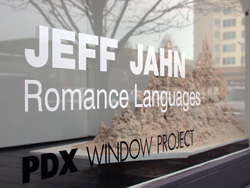
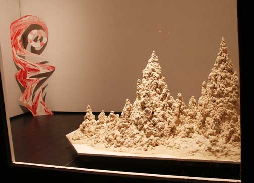
Today is the last day to get a glimpse of the PDX Window Project by PORT's own Jeff Jahn. As Jahn's statement explains, the project has less to do with "bodice ripping paperback novels and Valentines Day" than devising a visual language through the two "installation/paintings" on view. It is also unafraid to create desire, mostly through a series of pleasing contradictions that play off of one another. In the forefront of the window is a sweetly-scaled drip castle constructed from white sand. The two-tiered structure alludes to monumental architecture, no surprise given Jahn's long history with architecture. The fact that it is created from sand—which has long had a symbolic association in art with the passing of time and brings with it other connotations given the fact that this unstable material is essentially made from the ruins of rocks—undermines the architectural associations. Jahn also plays with formalism here, creating a sculpture that is in essence a result of hundreds of gestural drips, a quality one would normally associate with painting. Leaning against the back wall is a thin, angular panel topped by a Burton-esque spiral. Its red, white and pink hues, horizontal stripes and indulgent impasto make the work pure visual candy, but the ambiguity of its status as painting or sculpture inserts a problematic tension that resonates neatly with Jahn's sandcastle.
Posted by Katherine Bovee on February 25, 2006 at 8:41 | Comments (7) Comments ...oh bloody hell Katherine, but I guess placing an injunction on Port employee's to not review the thing would be a form of censorship. I thought I was out of the damn woods... show comes down today. Honestly, I intended this as just a little teaser (Gaudi meets Smithson?... it's tough to photograph), thanks for the kind words. Ill give everone a chance to throw daggers at me soon enough... ie a solo show sometime in the future. One note, the two pieces have titles... the painting is "Candy Muscle" and the sandcastle is "I am Switzerland, vanilla." Posted by: Double J Is it a painting or a sculpture? Amazing. Those are the kind of questions that I hope all serious artists are asking with their work. Posted by: jerseyjoe of course that's an academic, boring question... in fact, I never asked it when I was doing the work. It's kinda like criticizing a car for relying on wheels, yeah it's there but it's not news. I was more interested in food, bodylanguage etc. duh, but thanks for the paper tiger response. Historically, this is how Donald Judd could consider himself primarily a colorist. It's about the simple accumulating a complicated context. Actually, I'm most gratified that a collector who lives in a loft very close by enjoyed it because she's had to endure looking at the thing countless times as she walked by. Thanks btw. that made my day! As a critique I would have liked to have done something more extensive but wet sand is very heavy and without industrial floors 400lbs is all I could be comfortable with.... so I went spare, it's a teaser. Also, it was nice to use art to address and redirect a Brad Cloepfil designed space... he's always making white walls seem weightless and I thought introducing more gravity would add an interesting tension. Posted by: Double J Really. I'd much rather have conversations about whether or not something is a painting or a sculpture, than try and understand how a sand castle is simultaneously referring to food, body language, and redirecting the space in which it is being presented. Posted by: jerseyjoe I am glad you openly admit this is just a teaser Jeff. Unfortunately the 'Window Project' just seems to act as a place for "eye candy," rather than a full show in which one could consider the greater concepts at hand within the work. I do think the discussion of painting or sculpture is a rather unimportant one, because I think everyone generally sees them as sculptures. If is was hung directly on the wall, it would be a painting. Leaning up against the wall, it becomes a sculpture. Presentation is everything, but I do appreciate your willingness to merge/confuse the two. My only other comment is I didn't exactly understand what I was supposed to see with the sand castles (sand piles?). I understood the relation between "Romance Languages" and the peppermint colors in "Candy Muscle" when I first saw the pieces, yet I still struggle with the sand. I do not see a direct correlation between the sand and "romance," sex, love, body language, whatever; Except for the possible relation of fucking on the beach (something about pointy sand structures makes one think of this I suppose). However, I feel as if that blatantly obvious reference to something is not needed, simply on the ground that these sand castles look so interesting. You are creating your language with these castles, because the viewer sees these, and wants to apply a meaning (based upon what little details you have given them) just because the piles look appealing. Hopefully some of this makes sense, it has been a long day and I am unsure of how coherent my thoughts are right now. Also, a question for Isaac... Did you notice I used a compliment sandwich?! Posted by: Calvin Carl Sandcastles have been done (duh). But I revel in the miniature, it IS romantic (has nothing to do with the titling). Oh, I have to sneeezzzee....... Wooops, there went the whole piece. It's gusto, my dear man, a gusto, blusto. I want to not like it, but I went back for a gander three times. And you know, three, for me, is an eternity, the infinite number. Maybe I am just still dusty from moving my darn studio all weekend and living out of cardboard for the weeks to come - but I think you are on to something beyond the virtuality of childhood revery, Jeff. I am not sure what, but who I am to think for you? You've got a nice flow, and I don't even need a statement to proscribe me in any way in accordance with this lot, just the work to stand as tall as it will, weighty as it will be. In my imagination I magically transform these into lightweight plastic casts, mere shells of the resulting work. I see them as transluscent - but I still manage to see them, even if I look through them, I do not look past them. Though, like all glass houses, its just a reflection of what is uncontainable. Posted by: TJ Norris thanks again... but the use of sand is Very important to me... I like using something simple that anyone could use too. Somehow it's more evocative that way. Civilizations are fragile/vain things so making it less dirty and less transitive isn't where Im going to go. I don't want to be a part of making cultural expressions "more precious" either. The "Romance" title refers to latin rooted "romance" languages like French and the Swiss national language Romansch. The title is purposefully more poetic than informative... it lets the work do the work's work and the title can do its thing as a kind of atmosphere that can be ignored or brought to bear. Posted by: Double J Post a comment Thanks for signing in, . Now you can comment. (sign out)
(If you haven't left a comment here before, you may need to be approved by
the site owner before your comment will appear. Until then, it won't appear
on the entry. Thanks for waiting.)
|
![[TypeKey Profile Page]](http://www.portlandart.net/nav-commenters.gif)
| s p o n s o r s |
 |
 |
 |
|
 |
|
 |
|
|
|
|
|
|
|

|
Site Design: Jennifer Armbrust | • | Site Development: Philippe Blanc & Katherine Bovee | |