|

|
|||
|
Portland art blog + news + exhibition reviews + galleries + contemporary northwest art
|
||||


More Cloepfil/Still and More of everything else 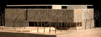 Brad Cloepfil's latest Clifford Still Museum design Portland's top starchitect Brad Cloepfil has unveiled a more finalized design of his Clyfford Still Museum. We saw an early model of it here and it looks like the heavy basalt-like look has been retained. There are two Cloepfil's, heavy Brad (Weiden + Kennedy HQ) and dematerializing light Brad (1 Columbus Circle). Heavy Cloepfil is way better and after spending some time at Kahn's Salk Institute last Fall... I understand why, it's all about making concrete and sky dance via material and forms in rhythm. (Kahn was a mentor to Cloepfil) It seems like this Still Museum reconciles the light side some too... getting away from his rival, Tadao Ando's precious qualities (yes his work is brilliant and is still way better than Cloepfil on his best day). Yet this new Still Museum looks like it has nice galleries but is definitely conservative in a serious way outside. Still is probably my favorite painter so this had better work, it looks reserved and that worries me. Reserved isn't bad (it's better than a dull outside like SAM). The Still Museum reminds me of the kind of water revealed basalt lava flows one sees in the Columbia River Gorge and Portland's Keller Fountain more than a typical building. Although I can't see Still liking ANY building that much I think this is moving in the right direction. A kind of non-descript anti-architecture, as archi-texture. Thanks to Tyler (Ive been out of it)...staying up really late helping to install right beneath Cloepfil's office (Yeah that's us banging on scaffolding at 3:00 am! sorry... can't be helped, it's for art). Oh yeah and we here he's moving... hopefully a to a nice new Cloepfil building (in Southwest Portland???) Hopefully that can be the uncompromising design weve been wanting since the W+K HQ, can't blame the client this time! Next the often money obsessed O keeps following the donations at the Portland Art Museum, but only when a $$$ figure somehow quantifies the ephemeral. This time out it is 3 million to endow the European curatorial position and programming. PORT presented this low key but big bucks campaign here first... check it our in-depth look at how PAM is doing something radical by being conservative fundraising-wise. Glad there will be an in-house European curator coming soon and here's an important point the O missed, during the Buchanan days they'd let positions remain unfilled for extended periods to make up budget shortfalls... that doesn't happen when you have restricted funds funding your curators. Congratulations PAM, I know more is in the works. MoMA's Color Chart: Reinventing Color 1950-Today was reviewed in the NYT's. Here's their slideshow too. Also, The New York Times reports Rem Koolhaas has a master plan for Waterfront City in Dubai. I've been reading his awesomely ridiculous essay Junkspace recently and I see this as the logical extension of those ideas. The guy's got a sadistic sense of humor with this dubai plan... I mean really nice Death Star Rem (I realize you justv threw it in there because it wont get built). Here's a worse idea, why not make that planet eating thing from the original Star Trek into a building too? Hence the reason Cloepfil gets to make buildings... Posted by Jeff Jahn on March 05, 2008 at 8:14 | Comments (3) Comments I agree with the posts on the Denver Post site. This is an ugly building. What is wrong with a building looking like a building- Posted by: elle4 I am on the fence with the new Still Museum design.I enjoy the use of textured concrete, but none of the geometric forms seem to create any tension or balance or really any other emotion. I guess then the question becomes, why do I feel the need for a building to exhibit emotion? It certainly looks like it will be a very functional space, which I suppose is beautiful in it's own right. Posted by: Calvin Ross Carl Blocky is fine but It doesnt have the same stately presence that Aero Saarinen's cruciform buildings have (like the Milwaukee Art Museum)... but I love the interiors. I'm wondering what color the outside will be? I think a dark grey will give it more heft than dusty tan. I think Cloepfil is simply trying to subsume the outward sculptural statement... and make it about the inside of the museum. It's ok from the outside... and looks very nice inside. Architechts are actually very reticent of simply reseorting to style.. though that's what the public often demndas of them. Posted by: Double J Post a comment Thanks for signing in, . Now you can comment. (sign out)
(If you haven't left a comment here before, you may need to be approved by
the site owner before your comment will appear. Until then, it won't appear
on the entry. Thanks for waiting.)
|
![[TypeKey Profile Page]](http://www.portlandart.net/nav-commenters.gif)
| s p o n s o r s |
 |
 |
 |
|
 |
|
 |
|
 |
|
|
|
|
|
|
|

|
Site Design: Jennifer Armbrust | • | Site Development: Philippe Blanc & Katherine Bovee | |