|

|
|||
|
Portland art blog + news + exhibition reviews + galleries + contemporary northwest art
|
||||


Brad Cloepfil's: Drawing / Making - Projects of Allied Works Architecture (1997 - 2007) at PDX Gallery 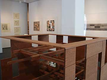 Brad Cloepfil's W+K Atrium (fg) Architects take definite stances towards the future be it; irreverent, hopeful, dismissive etc. Some like Rem Koolhaas are aggressive, breaking moulds and ruts first and foremost... making every other issue subordinate to their drive to reinvent. It is almost kitsch. While others like Portland's Brad Cloepfil seem to excel at making the future a bit more dignified. An inherently less reactionary or revolutionary stance but one that still has room for a few twists and turns within that essentially stoic outlook. In other words it is built to last. All of which sounds a lot like the city Cloepfil calls home, though his very presence scares the crap out of the "lets not change" crowd here. Still, Portland is more than a little interested in the future… no not monorails and tractor beams, it is more about design and quality of life. We want to inhabit a decent future instead of inheriting a crappy one. In short Portlanders have an obsession with a better life as expressed through interesting use of space, materials and all manner of other things basic for life (even the Hawthorne Neighborhood's hippies do this). The real trick is to transcend the ingredients and make life better without becoming a pastiche. Lots of notable creative people are associated with the articulation of this pursuit in the city, from designy artists like Sean Healy, Ellen George, Jacqueline Ehlis, Philip Iosca, Brad Adkins and Chandra Bocci, designers like Ziba, Skylab and Adam Arnold to architects like Randy Higgins, Holst and Rick Potestio. Making life better is simply a big deal here. Yet nobody in Portland is more associated with the way life can be affected through altering one's environment than architect Brad Cloepfil. 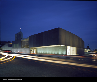 Brad Cloepfil's Contemprary Art Museum, St. Louis With projects from his early groundbreaking Weiden + Kennedy building in Portland to art museums in Denver, St. Louis, Seattle and New York, Cloepfil generates a great deal of discussion just by virtue of his success. 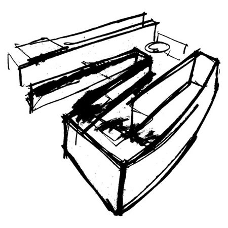 Concept Drawing for Contemporary Art Museum, St. Louis, 1999 Questions like: Is he just regurgitating modernism? Why hasn't Portland found a major new building project for our local starchitecht? How much of building X was his work and how much of it was the staff's? …seem to follow a regular orbit around him in the way that all successful people attract satellites. To the chagrin of those who enjoy those questions, Cloepfil's exhibition at PDX gallery doesn't gage his talent, relevance or success at all. Instead, it is an expose or a window into his practice, revealing some interesting wrinkles in his aesthetics along the way. Though the fact that he also designed PDX's gallery does make this a bit like that scene in Being John Malkovich where all one can see is Malkovich saying "Malkovich." 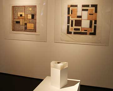 Concept Model for Museum of Arts & Design, New York 2003 (fg), Plan studies for Weiden + Kennedy HQ, Portland 1996 (bg) This show is somewhat special though, because unlike most of today's architects Cloepfil frequently sketches on paper. Frank Gehry also sketches but his work is a great deal more radical than Cloepfil's, whose work is more relaxed. Also, Cloepfil's models are assembled for their materials and effect (like the controversial Museum of Arts and Design) as much as their ability to diagram space as a plan. In other words he practices physical art making as a way to inform and drive the process of making buildings. Still, it is wrong to address these pieces as finished artistic statements. They are more like notes and experiments. Cloepfil is no da Vinci but he does come from that humanist/proto-scientist inventor mould… the type who sketches first in order to let the mind understand. Also, by using the hand vs. a computer it is more removed from the engineers and builders who figure out how to build this stuff. It may give him a more idiomatic edge but it also makes his pitch for various ideas more aesthetic… rather than a purely conceptual one. By literally building upon a hand drawn artistic practice, Cloepfil engages in a language of translation from his own body to proxy form. Once the gesture is completed these drawings make all kinds of arguments for themselves and their creator holds first refusal as to whether the pitch works or not. Really, it hardly matters how good or consistent the work is, only that it keeps Cloepfil engaged with the process. 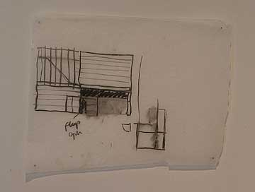 Elvation study for Koehler/Hanlon Beach House, 2006 For example the elevation study for the Koehler/Hanlon beach house is a quick sketch with a note stating, "flap open." Not exactly an earth shaking statement but probably put there to allow others to read the flat drawing as an invitation to enter. In other words a greeting, which is how most entrances can be read. It's tantalizing to speculate about the goals and effect of such a greeting: For example, did the architect notate the drawing for himself? If so then it implies the entrance had an indistinct quality as he should know what that smudge of charcoal stands for. Or was a "flap" chosen instead of a door to emphasize the casual nature of a beach residence? It is just a draft, but it is fascinating. If Cloepfil had notated the beach house drawing for his client or staff that is another thing altogether. That would indicate he wanted to focus on the flap feature and was seeking a response? If so how did it go? I like this sort of guessing game but I'm certain that some art gallery visitors aren't willing to become architectural anthropologists, too bad for them. 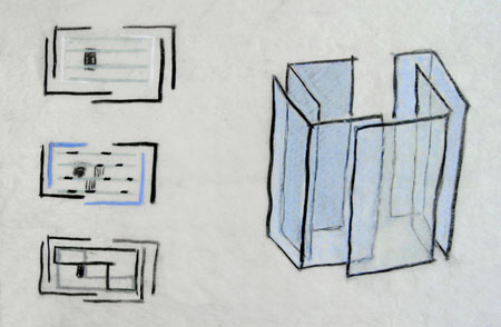 Concept drawing for Seattle Art Museum, 2003 Other pieces give more instant gratification like his early floor plans for Weiden+Kennedy and PDX contemporary art. They resemble the spaces that I've been in hundreds of times. The W+K HQ drawings come off like Anni Albers textiles, full of stiff but shifting rhythms. There is a tension in the works for the W+K HQ in this show that I don't see in any of his other projects save the Clifford Still Museum (more on that later). Generally, Cloepfil's line is generally loose and soft, not hard edge, explaining something about his aesthetics that I both love and dislike depending on the type of building... a certain lightness or dematerialization of space. At other times Cloepfil is earthy and heavy (which I prefer in his work). In this show Cloepfil's sketches often have a transparent softness caused both by his relaxed line, muted colors and penchant for using trace paper. You can see it best in drawing for the Seattle Art Museum; it is as if the drawings were made to calm the audience down. That kind of softness is somewhat anachronistic as Cloepfil generally works with a lot of hard rectangles and the Weiden+Kennedy interior is a masterpiece in that form. Consisting entirely of heavy rectangles made of flying concrete and giant wooden beams it honors the materials. His sketches for that building are similarly earthy. In many of his other spaces like the sadly defunct PICA exhibition space or the new PDX contemporary art gallery the white walls allow natural light to seep in from the sides. This dematerializes the wall and anything on them, and resembles the effect of his tracing paper drawings. Dematerialization isn't my favorite effect for exhibition galleries and I prefer Cloepfil's dark and heavy side seen best so far in the W+K building. Still, I understand Cloepfil's white walled dematerialization effect a lot better after seeing this show as nearly all of his art space drawings are on floating semi-transparent paper which when coupled with the architects loose lines have a classy, genial sense to them. This classy ease works great in drawings for St. Louis' Contemporary Art Museum or best in his drawings and models for the Krause residences.  Concept Sketch for Krause Residence (detail), 2007 The Krause Residence concept sketch with its cascading series of open cube forms are directly related to Sol LeWitt's modular cube forms. This is one building that gets me excited. The transparency of the trace paper and the open volumes are extremely elegant and Im certain the dematerialization will work perfectly in this forest setting. The model for the Krause guest house relates and looks even more Sol LeWitt. Might the Krause's be big LeWitt fans?  Structural Concept Model for Krause guest house, 2007 Other situations like Cloepfil's Section Study for a New World Trade Center are well, uninspiring blocks though not as offensively unimaginative like the final design by David Childs (the greatest failure in architectural imagination in human history). 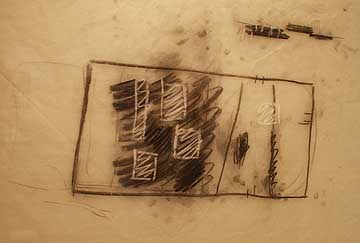 Concept Study for Clyfford Still Museum, Denver, 2007 The most interesting work here besides the Krause and W+K projects is the highly anticipated Clyfford Still Museum. The sketches are really fast and dark, almost scary. The exhibition spaces seem to be punctuated by large deep light wells from the ceiling. A study in light and dark. 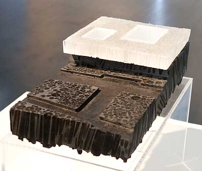
The model for the Still Museum consists of a basalt-like carbon base with a light filled clear box atop it. This model reveals Cloepfil (and Still's) Pacific Northwest roots best as Oregon and Washington are covered with waterfalls that resemble the light element (water) as well as the dark element (basalt lava flows over which the water flows). This could be Cloepfil's best building since W+K as it seems to embody the twin reactions to gravity itself; epic futile defiance and epic dreadful resignation. It makes sense, Still was a man of serious life and death convictions and no museum with his name on it should be without that combination of delight and dread. Overall, this isn't an authoratative exhibition on Cloepfil; the Portland Art Museum or the Seattle Art Museum will have to do that but it is a fascinating sampler that will probably annoy all but the biggest architecture fans. Through June 30th 2007 at PDX Contemporary Art *note none of these works are for sale Posted by Jeff Jahn on June 29, 2007 at 20:19 | Comments (0) Comments Post a comment Thanks for signing in, . Now you can comment. (sign out)
(If you haven't left a comment here before, you may need to be approved by
the site owner before your comment will appear. Until then, it won't appear
on the entry. Thanks for waiting.)
|
| s p o n s o r s |
 |
 |
 |
|
 |
|
 |
|
 |
|
|
|
|
|
|
|

|
Site Design: Jennifer Armbrust | • | Site Development: Philippe Blanc & Katherine Bovee | |