|

|
|||
|
Portland art blog + news + exhibition reviews + galleries + contemporary northwest art
|
||||


Roth, Nagy and Fenker alt-space explorations This January three Portland alt-spaces explore the ways simple materials and
space can articulate and complicate each other.
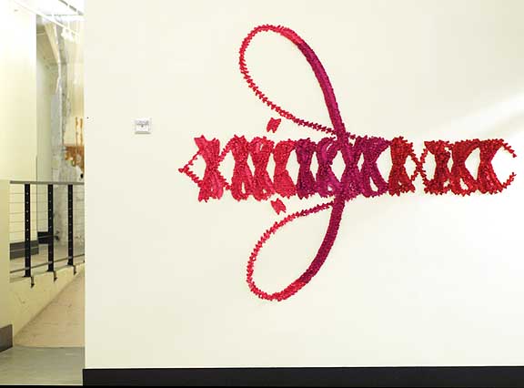 Roth's, "Everything must have an end except my love for you (Niagara)" at Gallery Homeland At Gallery Homeland Molly Roth's, "A story about Some People Changing" is a not to be missed show (it ends on January 31st). Roth has a fascinating way of drowning sentimentality in nearly abstract multi-vectored semiotics of language via the application of satin bows. For example, her "Everything must have an end except my love for you (Niagara)" at first glance has the look of legible script but it's a kind of mirror image pantomime of a signature and its really the gesture of the reversed loop and warm Valentine's Day colors that give it meaning. To these eyes it looks like the fetished lacings of a corset or a tall pair of boots so it's really a signature of binding sentimentality. Also, the fact that it looks to be reversed (written right to left) suggests a critique or partial cynicism regarding Roth's use of boudoir fetish and hallmark sentimentality. Think John Hancock's signature being forged by the Marquis de Sade, which is in turn translated by a young fashion designer onto a wall (backwards) using satin bows. 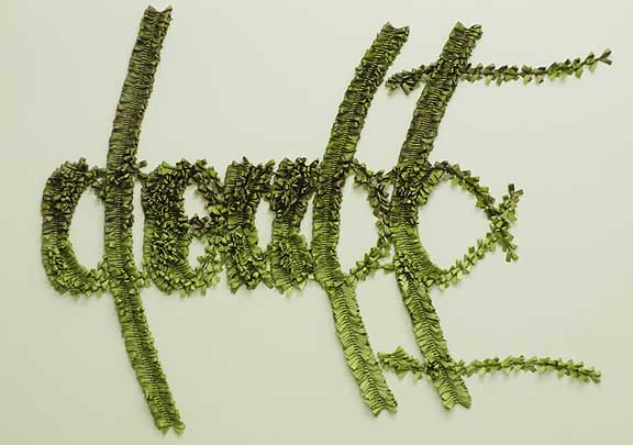 The Seeds (Doubt) Other pieces like "The Seeds (Doubt)" are much more legible but this doesn't diminish the work's effectiveness. Here Roth still abstracts the word, giving it a green cast, suggesting that The Seeds have now grown and not so metaphorically blossomed into doubt. It's her visual sensibilities that pull this off without looking like an illustration and instead the mirroring of the script indicates the self fulfilling prophecy of language. I like this as I distrust words intensely. Like the underrated Police song De Do Do Do, De Da Da Da says about dangerous words, "They're only cheques I've left unsigned." Here Roth signs but eschews the proper papers that would make her words official, instead opting for gallery walls… a province of indeterminacy where art excels above the world of laws and commerce. If anything the only real weakness of this otherwise very tight and accomplished exhibition is the space… a rambling corridor in a building full of creatives. After many consistently good shows this exhibition highlights that Gallery Homeland deserves a more proper white box space. 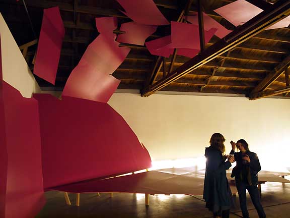 Nagy's Tidal Whereas, Disjecta has a proper space but Jenene Nagy's "Tidal" seems a little hamstrung by its quirks while simultaneously trying to engage them (in an impressive but not fully realized fashion). It would look better if I didn't have to compare them against Nagy's two other most-excellent architectural incursions, Shift at the Portland Art Museum and Nagy's breakout False Flat show at Linfield College. 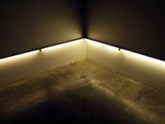
The show starts impressively enough with fluorescent lights creating a Flavinesque airstrip at night feeling but when one rounds the corner into the main gallery the fuchsia construction of drywall and two by fours feels both under illuminated and not properly scaled. The problem partially stems from the large trusses which dwarf Nagy's otherwise massive architectural incursions… about twice as much fuchsia drywall was needed to make the space feel proportionally addressed. The drywall also lacks the rhythm of Shift and False flat which played on the mostly horizontal kinesthetics of the immense western landscapes. We are talking "Purple Mountains' Majesty" in the distance here. (*Note: Woody Guthrie wrote many of his songs while working for the railroad in the nearby Columbia River Gorge.) 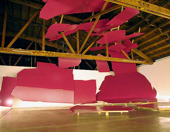
Instead of horizontal landscape, Tidal's large looming mass of drywall conflates floor and ceiling, somewhat sabotaging the horizontal line without replacing it with enough vertical mass to make it feel like a cave, wave or avalanche. It just doesn't feel like tidal pools, a giant wave or sky conflation so much as an unfinished band shell competing for attention with some much larger trusses. What's more the lighting highlights the flaws in the drywall work. Where Nagy is successful is the way she's solved the engineering problems of hanging massive bits of drywall 25 feet in the air… the problem is the way the trusses destroy their scale, making the Michael Heizeresque evocation of gravity less impressive. If you gonna go big like this, it better be impressive… and though the effort here is huge it lacks the design quality and scale of her previous work. There is also the fact that Shift and False Flat took place in completely finished white box gallery spaces… making the indoor/outdoor manmade/nature finished/unfinished conflations more effective… here the raw support timbers simply add another language, which ultimately weren't fully addressed. 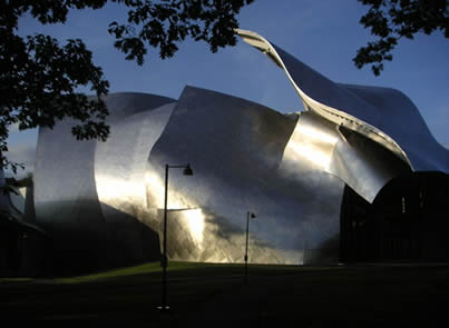 Frank Gehry at Bard College (photo Brad Fisher 2004) I should note, pulling off these rather architectural ideas is terribly difficult. In fact, most architects like Frank Gehry and Zaha Hadid (two earlier deconstructionists whom Nagy's work is related/indebted to) didn't hit their stride until age 50. At a much younger age taking on this kind of scale is applaudably risky… and through such priceless experience there are undoubtedly several key lessons which may prove more worthwhile than had Nagy simply repeated herself. Overall, in kinesthetic/material installations like this scale is critical …and though not an abject failure this show comes off as a little disappointing compared to Shift and False Flat's more thorough concept and execution (here it's a little like her piece in The Hook Up and feels like a prelude). Perhaps Tidal required more painted elements on the wall to more fully build up the scale + flat/3d conflations? Instead of a replacement of real space with theatrically flattened yet indeterminate space like Shift and False Flat, Tidal is less interestingly contained within the pre-existing built environment. It's the difference between being an inhabitant and becoming an environment. 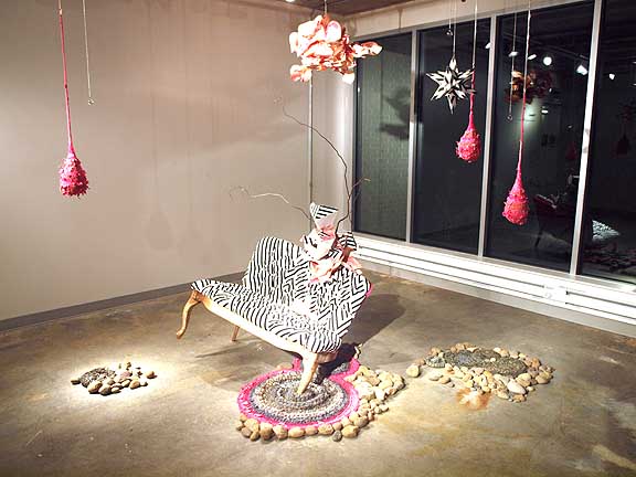 Kate Fenker's Prelude at MP5 Last but not least is Kate Fenker's Prelude at Milepost 5. Here Shenker creates a series of craft and theatrical spatial interventions like a catawampus couch, several knitted nest like hangings and several stone circles. Overall, it seems like a catalog of crafty art strategies that have been prevalent for the past decade or more. The couch recalls Rachel Feinstein's fairy princess castles and any trip to Miami in the past 5 years has rewarded viewers with a gluttonous dose of knitted simulacra. Still, I sense this is a workshop piece with a name like "Prelude." 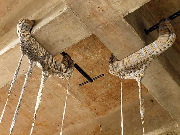
In particular, the knitted C clamps on the ceiling rewarded viewers with a much welcome surprise. Fenker will be doing more installations during her stay and it will be interesting to see how this is refined and developed. Posted by Jeff Jahn on January 25, 2010 at 17:06 | Comments (4) Comments "Gallery Homeland deserves a more proper white box space" So, so true. Now who wants to give Homeland a nice gallery space for free? And it is interesting just how differently things can be perceived. In Jenene's installation, I thought all the preexisting structures helped to create a more menacing environment. Something about all those shapes infiltrating the architecture gave me the feeling that those shapes didn't belong there, and would be crashing down upon the viewers in any moment. Either way, it was fantastic seeing an installation at Disjecta that really utilized the space. That damn gallery has the capability of dwarfing anything, and I feel Jenene succeeded in balancing the space very well. And whoa, those C-clamps in Kate Fenker's show are excellent. Posted by: Calvin Ross Carl of course everyone see things differently. For example, a lot of artists look at other's work for what they can use... whereas as a critic/curator I engage in comparitive aesthetics so her previous shows come into play and I have to consider the overall gestalt/implications. Overall, I doubt anyone will argue that Tidal is more coherent and conceptually tight than Shift and False Flat. Also, I tend to see a show for its aims and potential and I just cant help but feel that with more time and a few different strategies Tidal could have been Jenene's best work to date. Instead, it's transitional and mixed with a little less design quality traded for the slightly larger size and a lot more engineering. False Flat was nearly as large but way more immersive. Overall, its classic case of bigger not being better. Still it is absolutely worth seeing, I love her work... which also means I'm tougher on it. Had this been the work of a recent art school grad I would have been thrilled but she's capable of more. The lack of wall painting is missed. Posted by: Double J I am really impressed by Jenene Nagy's show. Granted, I didn't see False Flat, but I did get to see Shift when I was visiting Portland. I loved Shift, and also her show at Dinnerware in Tucson. But I have to say that I agree with CRC, I really enjoyed seeing a show that successfully utilizes the Disjecta space. The pieces hovering above us feel overwhelming and powerful. And I did see the show without anyone else there. I think the show is a great one to see outside of the reception, to fully experience the space Jenene has created. I love her work. Posted by: Blake I think it's important to be tough, especially on artists who have great promise. Still, from my experience the scale problem with Tidal was even more pronounced when I saw the show alone. Again, I feel the show's lack of both painted and built elements made it's scale too easy to determine, whereas Shift and False Flat made the existing structure more difficult to gauge and thus more interesting. Instead, Tidal is very much a show in a space not a show that creates space both real and imagined like Nagy's other installation works in Oregon... also Avantika Bawa does this same thing very well in the Archer show up now. I can also say I spent the whole weekend fielding similar critical sentiments from others in the scene... overall, we all wished Tidal was somehow better than it came off. What's more, besides "memory" of the three shows another test are the images. Just check the links. The level of finish and rhythm for Tidal is not as good as Shift's and False Flat was much much more coherent and immersive with its clear horizon line. Now, I'm not suggesting that a horizon line was necessary but the floor to ceiling vertical is somewhat confused gesture here and not as developed an idea. Whereas in the past Jenene was playing with the conflation of landscape and billboards on a road trip to LA.... it was an interesting and very clear conceptual move to translate it to a gallery space. I miss that conceptual and design clarity in Tidal. Overall, besides the fact we all like Jenene personally, I'm still not hearing a conceptual justification that sets up how the show succeeds. Here the size alone isn't that remarkable (it's medium sized not immense like Mass MOCA or Tate Modern's Turbine Hall) and most people who have traveled a lot wont find the size of the exhibition or the fact it goes "up" in itself novel. There are good ideas in Tidal (gravitational, ebb and flow) but it doesn't feel fully realized, especially compared to earlier efforts and that isn't a bad thing. Consistency is the hobgoblin of little minds and it's worthwhile to take risks that don't completely pan out. Posted by: Double J Post a comment Thanks for signing in, . Now you can comment. (sign out)
(If you haven't left a comment here before, you may need to be approved by
the site owner before your comment will appear. Until then, it won't appear
on the entry. Thanks for waiting.)
|
![[TypeKey Profile Page]](http://www.portlandart.net/nav-commenters.gif)
| s p o n s o r s |
 |
 |
 |
|
 |
|
 |
|
 |
|
|
|
|
|
|
|

|
Site Design: Jennifer Armbrust | • | Site Development: Philippe Blanc & Katherine Bovee | |