|

|
|||
|
Portland art blog + news + exhibition reviews + galleries + contemporary northwest art
|
||||


.meta-resolution 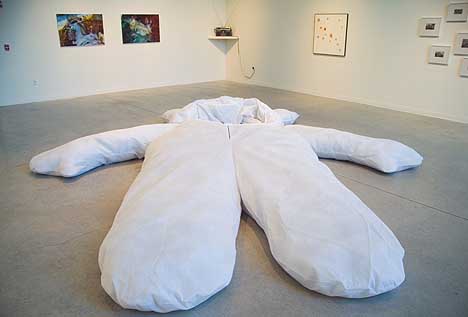 Nayland Blake's The Big One (fg) The current show at Linfield College entitled .meta, is curated by TJ Norris and the finale in an unofficial trilogy of shows including Grey|Area and invisible.other. This very ambitious and diversified show consists of twenty works by eleven artists all completed within the last five years and range from sound sculpture to photography. What's more, .meta is organized in a tersely subtextual manner for the viewer - so much so that the exhibition as a whole has ceased being implicit and has become a curatorial affectation. Luckily, on an individual level some of the artworks are able to speak for themselves. Upon walking into the gallery the first piece you notice is Nayland Blake's The Big One, an unavoidable Halloween-esque monument. The large bunny suit is probably seven times that of an average bunny suit and beckons the viewer to climb in and interact with it. Luckily, I fought the urge - just barely. By sheer size alone, it has undoubtedly become the centerpiece of the show. Blake's piece by itself makes the trip to McMinnville worthwhile. 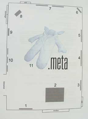
The Big One is the only image on the map that is provided at the entrance of the gallery. This is an odd choice. The map then bestows Blake's work with obligatory attention that is unnecessary do to its size and instant aesthetic accessibility. The map is also very important because none of the pieces are actually labeled in the gallery. If the viewer missed the map, they would then miss a vital part of the show. But if the viewer finds the map the first thing they understand visually is "bunny" and secondarily about a period and the letters that follow. It might as well be called The Bunny Suit Show (.meta). Curators have certain responsibilities. First, the curator conceives of an ideal - manifesting a visual communication of this abstract ideal is the entire motivation for the show, regardless if it is actually manifested or not. Second, a selection of work based upon the criterion of the ideal is made. It is then left up to the curator to organize the gallery in the manner that most effectively communicates the predetermined ideal to the viewer. Without a communicable ideal, the purpose of seeing the show in its totality is lost, becoming a masturbatory act of abstruse curatorial activity. Despite this, the viewer gives their best efforts to absorb the totality of the fanfare as it's presented. In this case, The Big One's massive presence is an unavoidable encounter upon entering. This creates a radial divide in the viewer's path from any vantage point in the show where the viewer often encounter's obstructions to experiencing multiple works. For example, when the viewer stands at the feet of the bunny and looks above to the opposite side of the gallery where they see an early 90s style boom box which is diffusing a quiet, ambient noise. Then the viewer's eyes drift back to Jesse Paul Miller's sound installation as if antennae and bunny ears are a call and echo reverberating a pleasant visual connection. But before the viewer can fully engage Miller's work, they have to walk around the bunny suit forcing the viewer to pick a side of the fork and commit. I chose to go to the left and was quickly pulled in the direction of a louder piece, both audibly and visually. This arrangement continually causes disruptions for connections throughout .meta. Within the oceanic parameters of this show, Norris has laid out a large problem for himself: to translate a wide range of art into a coherent ideal. At stake is the communicated understanding or convolution of the ideal. What clues are left for the viewer? How does the viewer understand the transitions between the works? Unfortunately, these questions are crucial and left unanswered. Without clues that lead to a clear definition of the dialectical interplay - i.e.meaningful congruency in the empty spaces - the pieces only stand by themselves, orphans on the side of the road, individuals stranded by a curatorial action. Conversely, the curator should be creating a harmonic presence much like that of a well-developed mixtape. This presence is an aesthetic delight of; ebb and flow; dissonance and resolution; panic and relief; hunger and satisfaction; silence and noise. Because this dialectic is absent, the viewer is left with an irresolvable noise "subtext" or .meta-subtext. 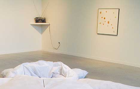
(bg)Jesse Paul Miller's boom box (l), John Waters' 21 Pasolini Pimples (r) Coincidently the subtle ambiance noise of Jesse Paul Miller's boom box is overpowered, for the most part. When walking to the left of the bunny suit and in the direction of the boom box a sound of many small wheels with batteries attached to it pulls the viewer in. The video installation by, Pe Lang + Zimoun's Swarms of Autonomous Vibration Motors is intriguing as both a scientific inquiry and a clever visual pun that yields many interesting fetish-sized sculptures in the aftermath of exhausted batteries. The sculptures are placed on a shelf below the video. After a moment of hypnosis caused by a video of tiny wheels attached by smaller wire that lead to watch-sized batteries flying erratically back and forth across the TV screen in a most sperm like manner, I was disappointed that the video quality was so poor. The inconsistency created by the quality of the video and the ingenuity of the sculptural element is not a satisfactory dichotomy and leaves the viewer a bit confused. At this point the viewer is wondering, what exactly is the curator's ideal? The biggest hint toward an answer is "subtext". Subtext is an excuse to place eleven talented artists in one gallery and the work is left to duke it out for the viewers attention. This could be a good idea, much like that of serialism without the rules. Even in a close analysis of the artist's statement, there is a drought of creative direction for the viewer to be guided. Norris states that .meta gives an instant association with fascinating phenomena. One example he provides is metadata. Actually, metadata is a really ugly example. There are few things more boring than data - especially data about data. And even if it were a good example, a title can't endow a show with anything more than a hint at central ideas. When the title is an abstractly utilized prefix and the core idea is "subtext", asit is here there is nothing for the viewer to be guided by. A collection of orphaned ideas isn't much of an exhibition. The poor video quality of Pe Lang + Zimoun's work mildly hinders one's appreciation of the piece, also causing the viewer's eye to wander elsewhere. The viewer who looks to the right sees two large red cedar dice and might wonder, "Why are there two large dice there?" And yes, this is a question that anyone could ask themselves about most any show with large dice, but there is a distinct possibility the dice are placed as a non-linear transition. Still Jack Daws' Indian Dice isn't one of his strongest pieces, which tend to be both subtler and more viciously cutting. More importantly, the piece is sadly being overshadowed by the three pieces surrounding it and seems to add little or take away from the entirety of the show. .meta is working to achieve an aesthetic much like a mixtape - a mix of random artists hinged together with a nostalgic premise that is present throughout the tape, CD or playlist. The mixtape is a great part of postmodernity and, if you are familiar with them, you understand mixtapes hold many of the same standards this show is working to achieve. A mixtape, when given to a boy/girlfriend early in a relationship, coupled with the musical selection, can be "ambiguous", "awkward", "forbidding" and "ludicrous". If those qualities are a standard of success, then that is exactly what Norris has provided as a whole: that is, to claim curatorial rights without the problem solving and creative context building that is required of a curator. All that remains is preference without explanation, a puzzlingly composed mixtape or in this case art lacking adequate transitory space. 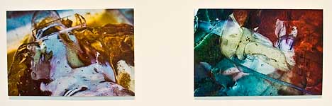 Harrison Higgs What you Sew and What You Eat To the right of Daws' work is Harrison Higgs two examples of contemporary abstract photography. What you Sew and What You Eat are beautiful representations of the quality of work that Higgs is known for, and both pieces are autonomous islands of solace created by a trinity of photographs, artist statement and titles. This trinity creates a beauty of waste and consumer byproducts to our eye in a subtle yet simultaneously plainly-stated visual and written modernist vernacular. Continuing clockwise from Miller's sound sculpture, John Waters' 21 Pasolini Pimples evokes the great Italian intellectual Pier Paolo Pasolini: pimples and possibly the number 21. It is twenty-one randomly cut out photos of what looks like pimples on TV. Each photo is pixilated and distorted. I understand why his other work has drawn some critical acclaim but it is hard for a one liner from a larger body of work to create a connection that holds interest. Jenevive Tatiana has seven Sunday Paintings consisting of sequins and .metallic thread on newspaper. Tatiana's artist statement is very revealing and added depth to the work. It is too bad that the seven pieces were placed so closely together. A sense of claustrophobia ensues and soon after the viewer migrates on. 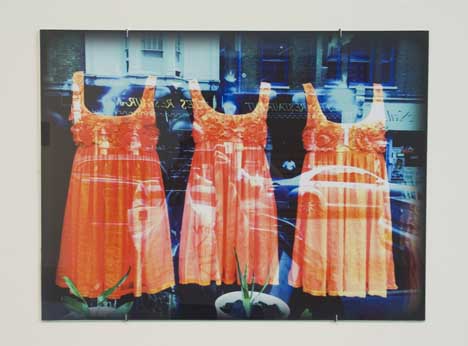 Dress Robin Rimbaud / Scanner's Dress is a digital print of three very orange dresses. It is a fun picture but I didn't find anything in it that compelled me to look any longer once I figured out it was a reflection picture. 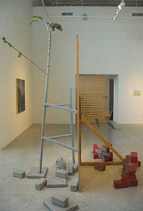
Robison's Decoy (fg), Speer and May (bg l & r) Stephanie Robinson's large sculpture, Decoy, is placed in the front of the gallery by the window, a location that lacks a desired radial view. It achieves the homemade aesthetic that Robinson aimed for but it seems to have lost its conversation with urbanism and construction in McMinnville. Eva Speer contributed It Follows, a celestial oil painting. Placed just right of the entrance it is not one of the first pieces you see. In a less erratic show this work could inspire tranquility. 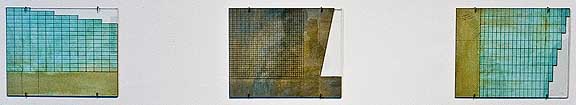 D.E. May's Template, Template & Template Last but not least is D.E. May and his three pieces, all entitled Template. They are very subtle works that look like some strangely colored - or possibly moldy - paper that was once something out of an excel spread sheet. May's artist statement allowed me one more moment in this busy mixtape show to hear a soft story and develop a close relationship with the artist's notion that "there are times I look down at the worktable, and I would just like to remove history." Sometimes it is the silence that does all the talking. With so many different agendas on the gallery plate, the curator has made it difficult to find the one idea that is really pulling the show out of .metaphysics and back into an atomic reality. In the end, the subtext was too deeply abstracted and the viewer is left feeling unresolved and genuinely confused about the text for which .meta is prefixing. The show Norris manifested has many talented artists, but overall his ideal confuses the gallery space and distracting properties of the pieces as arranged, overwhelms the space and the viewer. Still, when the viewer is able to isolate each piece into autonomy, several pieces make the show really worth seeing. McMinnville as the heart of "wine country" is a bit of a step out of the Portland metro area, but I had no second thoughts about making the trip. Posted by Alex Rauch on November 12, 2008 at 13:16 | Comments (0) Comments Post a comment Thanks for signing in, . Now you can comment. (sign out)
(If you haven't left a comment here before, you may need to be approved by
the site owner before your comment will appear. Until then, it won't appear
on the entry. Thanks for waiting.)
|
| s p o n s o r s |
 |
 |
 |
|
 |
|
 |
|
 |
|
|
|
|
|
|
|

|
Site Design: Jennifer Armbrust | • | Site Development: Philippe Blanc & Katherine Bovee | |