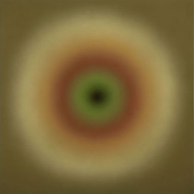
Joe Macca
Untitled, 2007
Acrylic and Oil Medium
45" x 45"
Image courtesy of PDX Contemporary Art
Copyright Joe Macca 2008
When I look at Joe Macca's paintings, I am always surprised with the subtle division between the forms and the color of his work. One might think of it as the forms are the drawing component of the work, while the color is its realization. One is the vehicle, and the other is the message. I am taking the time to make a distinction between color and form in these paintings because in his case they reveal his process in an extraordinary way. The paintings are a union of opposites: between the square and the circle, between personal and the public, between the abstract and the real. In his most recent paintings in Slowblivion at PDX Contemporary Art, the forms are vibrating concentric circles that float between the edges of the square panels. A circle is a shape in which all points along the edge are equidistant to the center. It is a shape that is infinitely symmetrical and has all kinds of visual associations, whether it is astrological, like the sun and the moon, or physical, like the circles found within our bodies like our eyes. Circles have probably existed as long humans have turned their eyes to the sky. So when Joe decided to use the circles in his painting, he was engaging in a long tradition.
Ken Noland made beautiful paintings of circles in the sixties. Each circle was crisp, clear and painted in beautiful acrylic colors. In Joe's paintings though, his use of the circles comes out of a different need, at a different time and place. I don't think he was interested in the geometry of the circle as much as he could use the form as an empty vessel. There is nothing personal about the circle; it is equally available to anyone. It is not a shape that he invented. I think he liked it because it was the opposite of square, and it is the natural choice to define a form that is separate from the rectangular geometry of the panel. He could use the circle as an empty shape and fill it with the way he sees the world. Graphically, a series of concentric circles centered on a square panel is a very strong statement. It locks you into an experience in which the painting will either project or recede from the picture plane, rather than translating across the picture plane, either up and down or to the left and right. It was as if from the very beginning, Joe had decided that the relationship of the concentric circles to the edges of the panel was going to define how the paintings interact with the world beyond the picture plane.
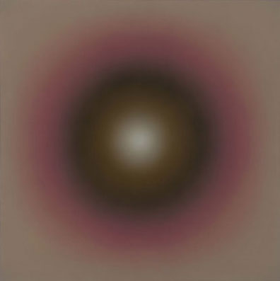
Joe Macca
Little Friend, 2007
Acrylic and Oil Medium
45" x 45"
Image courtesy of PDX Contemporary Art
Copyright Joe Macca 2008
If the forms of the concentric of circles are abstract, Joe's choice of color is completely personal and derived from his experiences in the real world. Rather than being interested in abstract color combinations, his sense of color comes from what he sees around him. It might be moss, the colors of spots on a moth's wing, or it might be the colors found in publicity pictures of celebrities. Where the colors come from is not really as important as understanding that each color has a very specific association. The work is blending seemingly contradictory ideas and it is what gives the work its charge. The circle is general, but the color is specific. The paintings are not abstract or real, but both at the same time. I think the paintings become microcosms of personal experience - little models of how each of us interact with the outside world on a daily basis.
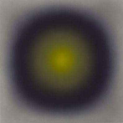
Joe Macca
Untitled, 2007
Acrylic and Oil Medium
45" x 45"
Image courtesy of PDX Contemporary Art
Copyright Joe Macca 2008
Everything about Noland's work is clean, sharp and clear. The circles are either hard-edged or deliberately hand-painted. The idea of the painting is directed to making a strong graphic statement. In almost every way, Joe's paintings are probably the exact the opposite. The big problem with putting circles on a square panel is the corners. If the painting is about the circles, then the corners are just left over and tend to be experienced like a residual space, not necessary to the experience of the painting. This is why most Cubist paintings are dense at the center and dissolve when approaching the corners. The corner has a flattening effect and works against the deeper space in the center of the painting. More often than not, Picasso and Braque thought that the best way to deal with the corners was to ignore them or to literally cut away the corners whenever possible. Noland's hard-edged circles only seem to emphasize the left over space of the corners. When Joe decided to soften the edges of the circles, I think that he found a way integrate the corner into the composition without ignoring it like the Cubists or emphasizing it like Noland. Joe's paintings are built of many thin layers of acrylic airbrush between very thin layers of paint medium that is brushed on and sanded down. The cumulative over spray of the circles tends to soften the distinction between the circle and the corner, softening the distinction between figure and ground. The result is that we see the corners, but they are not always pulling our attention away from circles. In this way, the corners are quietly integrated into the composition.
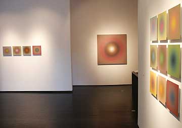
Slowblivion installation
The result is that the paintings are surprisingly engaging. The soft outlines of the circles continuously bring our eyes to the center of the panels, where it bounces back to the edges to begin the whole process over again. The paintings are quiet and serene, as if by looking at the panels, we have the benefit of meditating with our eyes open. We are engaged in a floating stasis where we are compelled to keep looking at the paintings a little longer. They become mirrors of our private experience, where our experience is reflected back to us so that we might see ourselves for the first time.
Joe Macca's Slowblivion at PDX Contemporary Art until February 2.
There is a real sense that Joey put it all together this time. His last three abstract shows seemed like they were re-calibrations after his initial Hedz series... and by that I mean he was creating studio shows driven by studio concerns. This time out I think he stopped caring what anybody thought andit shows. It's as if he has been trying to fit a square peg through a round hole and instead of giving up he simplydecided he needed to focus less specifically. (And people sometimes still wonder what Greenberg's collection has to do with the local art scene???)
Joe's chiding of curators etc. hasnt hurt him at all as some suggest, but we have been waiting for him to give us something that wasn't so reactionary towards aesthetic trends and personalities. Nice work Macca.... it also goes to show how long the road can be for an artist to mature fully (not that I'm actually accusing you of that Joe).


![[TypeKey Profile Page]](http://www.portlandart.net/nav-commenters.gif)